Hi friends and welcome to my blog this Monday! It's the last day of April and this month went past so fast. Today we are celebrating Walpurgis Night in Sweden and we will go and look at a bonfire.
This week we have a Time Out (time related) challenge at the Simon Says Stamp Monday Challenge Blog, and it is the last week for our April guest designer Paula Roomer aka PaNaRoo.

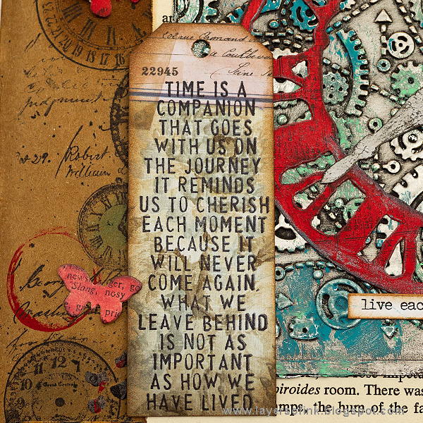
I was inspired by this Tim Holtz sentiment stamp about time, which is a favorite of mine. The page is done in my Dina Wakley Media Journal, on one of the kraft pages. I aimed for a grungy look this week, and there are lots of different clocks on the page.

I had already added the stenciled dots on this page, when I wanted to use up leftover paste a while ago. The paste was colored with Dina's metallic Medieval paint. I stamped various clock stamps here and there.

The clocks were inked with Distress Inks.

The background was stamped here and there with a script stamp.

I wanted touches of red on the background and stamped red paint, with the lid of the paint bottle.

Black paint was splattered on the page. I also added some dry brushed silver paint.

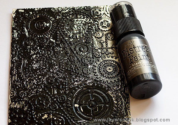
Foil tape was adhered to cardstock and dry embossed. I was planning to have used another embossing folder, namely the Pocket Watches, but couldn't find it, even though I looked for a long time. It will fit the theme even better than this one.

Paint with Black Soot.

When the paint is almost dry, remove most of it with a paper towel.

I dabbed on some Cracked Pistachio and Mermaid Lagoon paint. Wipe some of it off, if you want to.

The Sizzix Weathered Clock was die cut from Heavystock paper.

I painted the clock red and the arms silver.

It was distressed with some stamping, using a calendar stamp, and black and brown paint.

Finally I added a touch of silver with the Brushed Pewter Distress Crayon.

The title was die cut with the Storybook die from paper I found in my scrap box.

The sentiment was stamped on a piece of patterned paper, turned into a tag with the Angle Corner Chomper tool.

The metallic panel was layered on top of an old book page, with an interesting sentence at the top of the page. There is also some Design Tape.

I scribbled around the edges with the metallic Distress Crayon. It looks nice on the dark background.

The Paper Doll girl was colored with Distress Markers.

I always liked the look of dry embossed foil tape since it gives such cool texture.

I also added some Small Talk stickers, which fit with the them.
I hope you will join us this week in our Time Out challenge. As always, you have a chance to win a $50 gift voucher to do some fun shopping at Simon Says Stamp. You have until next Monday 8am Ohio time. 1pm UK time, 2 pm CET to join in.
* Please note: the links are affiliate links, for which I receive a small percentage of sales generated by the link, at no extra cost to you.


Awesome project! Thanks for the details!
ReplyDeleteGorgeous art journal page Anna-Karin :-) the background is fabulous, I love the embossed gears and colours, so pretty and the clock and all of the details are awesome! A timeless beauty ;-)
ReplyDeleteluv
Lols x x x
The background is amazing and the way you put the different layers of the decoration elements on it looks great. A wonderful Artwork!
ReplyDeleteDear Greetings
Sabine
Love the vintage feel with the distressed red. Gorgeous!
ReplyDeleteBeautiful Anna-Karin 😊 love the vintage look.
ReplyDeleteAlways love seeing your art--gorgeous!
ReplyDeleteBeautiful page, the background is fantastic, thanks for showing how you've made it. Hugs.
ReplyDeleteWOW Anna-Karin, as always, this is beautiful done. Thanks for the tutorial once again.
ReplyDeleteStunning project, Anna-Karin! I love the texture and POP of red!
ReplyDelete*mwah*
Steph
Simon Says Stamp!
Ooh, I love the warm red and sepia, and that central embossed panel is beyond cool with the metallic blues and greens. Fantastic composition to the whole page too.
ReplyDeleteAlison x
Such a great, grungy project with so many wonderful details and so much gorgeous texture! I especially love the pop of red which really does pop off the page and the little paper doll is the perfect image for this piece... :)
ReplyDeleteAnna-Karin, this is and amazing and grungy piece! I especially like how you used the red with a number of your elements - that really caught my eye! Gorgeous texture and design, and the ballerina and quote are a delight! Happy May! Maura
ReplyDeleteWonderful page! I love the kraft background and pops of red!
ReplyDeleteThis is a great project! I loved seeing all the detail shots and I really like how the background has those metallic touches. The red accents are so great, too!
ReplyDeleteWow the colours and textures on this page are so good. Thanks for sharing
ReplyDeleteWow... this is such a stunning creation, Anna-Karin. The texture on the background and all the embellishments are amazing. :)
ReplyDeleteAmazing project Anna-Karin! grunge style is fabulous and you gave new life to this words with your page! Love love love! Barbara
ReplyDeletelove your grungy art journal page Anna-Karin, so much detail and beautiful textures, hugs kath xxx
ReplyDeleteThis is amazing, Anna-Karin! Love the Kraft with the pops of red, it really is striking. So much wonderful textures and details! Hugs, Sandra
ReplyDeleteThe background in this project is so intricated! I loved looking through your photo to admire every single little detail!
ReplyDelete