Monday, March 31, 2014

Dry Embossed Easter Card

Hello again! A second post for today, don't miss my Simon Says Stamp Monday Challenge fabric tag below. I am also sharing a card on the Sizzix blog today.

I made an Easter card using some of Tim Holtz new dies and embossing folders. If you use a different image, it can work for any theme. The embossed background would also look great on a scrapbooking page or art journal. These new embossing folders have a very fine and detailed pattern, which I really like.

For more details and photos, head over to the Sizzix blog.

Thank you for stopping by!

Anna-Karin

Here & Now Fabric Tag

Hi and welcome! Another lovely day and a new great challenge at Simon Says Stamp Monday Challenge Blog, and it is an anything goes week. I made a tag using a lot of Tim Holtz products.

I sometimes find the anything goes challenges to be hard, since there are so many options. This week, I really let my project be anything goes and just sat down, collected some stash and scraps together and made a tag without much of a plan. I cut strips of Eclectic Elements fabric for the background, frayed the edges and stitched them to the background. I liked the mix of words, numbers and the butterfly.

I set an eyelet in the tag to tidy up the punched hole. The Alpha Parts arrow was painted with Antique Linen and coated with Glossy Accents.

For the focal part of the tag, I layered a bunch of die cuts and papers together. There is a strip of die cut Frameworks, a distressed Alpha card, a die cut flag stamped with a small dancer, two ephemera pieces and a bunch of tiny die cut butterflies. I've been using the Butterfly Frenzy die a lot since I got it. For a sentiment I used another Alpha Part, painted and coated with Glossy Accents.

At the bottom of the tag, I also added some layers, using a film strip ribbon, rub-on words and an Industrious sticker. I particularly liked the lines created with the film strip and the fabric lines showing through underneath.

Join us this week in our challenge and remember that anything goes. It might be you who wins a $50 gift voucher from Simon Says Stamp, drawn randomly.

http://www.simonsaysstamp.com/servlet/StoreFront

Thank you for stopping by and have a lovely week!

Anna-Karin

Supplies:
Surfaces: Tim Holtz Eclectic Elements fabric; Tim Holtz Idea-ology: Collage Mini Paper Stash
Dies: Sizzix: Courtyard Frameworks, Butterfly Frenzy, Ribbon Flags
Stamps: Stampers Anonymous Tim Holtz: Tiny Things
Ink: Archival Ink: Red Geranium; Distress Ink: Gathered Twigs, Black Soot
Paint: Distress Paint Antique Linen
Embellishments: Tim Holtz Idea-ology: Film Strip Ribbon, Frames & Trims Industrious Stickers, Expedition Ephemera Pack, Alpha Cards, Framed Alpha Parts, Life Quotes Remnant Rubs
Adhesive: Ranger Glossy Accents

Sunday, March 30, 2014

Spring Covered Bridge

Hello stampers! Our Let it be Spring challenge is almost over at Craft a Scene, and I have one more card to share.

I made an autumn card with the large Stampscapes Covered Bridge stamp last year, and wanted to do something similar, but with spring colours. This stamp is perfect for colouring with markers directly on the rubber and then stamp. I used green and brown markers for the trees, brown for the bridge and grey for the stones. After stamping, I added more colour, using dye inks and a Colorbox Stylus tool. An extra tree was stamped to the left to cover up some white space there. Finally, I added some highlights and flowers with a gel pen.

Thank you for looking!

Happy Stamping!

Anna-Karin

Supplies:
Stamps: Stampscapes: Flock 112A, Sedge Filler 251C, Curvy Branch 271G, Covered Bridge 318I
Ink: Adirondack: Aqua, Willow, Lettuce, Pesto, Stonewashed; Distress Ink: Peeled Paint, Pumice Stone; Archival Ink: Jet Black
Markers: Distress Markers: Shabby Shutters, Peeled Paint, Forest Moss, Walnut Stain, Pumice Stone
Surface: Kromecote glossy cardstock

Saturday, March 29, 2014

Silhouette Filled With Thoughts

Hello! I hope you are having a good day! We have a new CSI: Color, Stories, Inspiration case file:
 
My layout:
I've been wanting to do a layout about my son's curiosity and million 'why' questions every day. Why do we have a skeleton? Why does the Pink Panther not have a skeleton? Why is Dusty orange? Why? Why? Why? Why? I was very inspired of the case file photo, as you can see, and thought a silhouette filled with different thoughts and questions fit well for the theme. From the evidence I used: metal, silhouette, and monogram. And from the testimony I was inspired by thought processes and ideas. I first used black cardstock for the background, then I remembered this Core'dinations paper and thought it fit much better.

First, I started looking for silhouette templates online, but I changed my mind and used a photo of my son instead, to make it more personal and meaningful. I converted the photo to 'photocopy' in Photoshop Elements, cropped the head and printed it on watercolour paper. I painted the head with Iced Spruce Distress Paint. To fill the head with items, I mainly used Tim Holtz Sizzix die cuts and different small embellishments.

I found a photo of my son standing on a fence and cut him out. The globe was die cut twice from mat board, only using the continents from the second piece. It was painted with Distress Paint, stamped and then coated with Glossy Accents.

Most of the shapes were die cut from mat board, which gives a nice white surface to work on, great for both paint and ink. The gears were painted silver, distressed, stamped with a number stamp, inked with Black Soot and covered with Glossy Accents. The owl was painted black, backed with a number paper, got a sentiment with Label Stickers (spelling 'why') and also coated with Glossy Accents. The stars were painted and covered with Rock Candy Distress Glitter. The number 4 was inked red, stamped and also coated with Glossy Accents.
 
The shapes that are crackled were coated with Wendy Vecchi's new Crackle Paste (love it!) and when dry painted with watered down paint. I filled in the spaces between the larger shapes with metal gears, small wooden embellishments and other small items.
 
The bottle was not completely covered with paste, to give the look of it being filled with something. I found a few question mark chipboard shapes in my stash.

Insects are very interesting, which is why the heart was stamped with a bee stamp. I should have added a spider too, but only thought of that later.

A crackled butterfly, light bulb, little bird with a stamped word and more fun things. I only used items that were meaningful in some way.

The car was painted black and covered with Crackle Accents. I think the houses are also covered with crackle accents, they were in my scrap box. I love to place little words and details here and there, such as the words stamped on the arrow. This was a fun project! My journaling was really long so I printed it on an A4 paper and tucked it behind the layout. It is about being curious, learning things and that it is a good thing to ask 'why'. And about me having to think out sometimes creative answers to questions that can't always be answered.

Thank you for visiting! I hope you can join us this week!

Anna-Karin

Supplies:
Surfaces: Sizzix Little Sizzles White Mat Board 6 x 13; Core'dinations cardstock; Canson Watercolour Paper
Dies: Sizzix: Vintage Fan & Globe, Mini Old Jalopy & Arrow, Townscape On the Edge, Mini Tattered Leaves, Mini Apothecary Bottles, Mini Owl & Crescent Moon, Mini Hearts Set, Mini Gears, Mini Pine Tree & Holly, Mini Butterflies, Cargo Stencil Numbers, Mini Bird & Cage, Vintage Market XL, Crescent Moon & Stars
Stamps: Stampers Anonymous Tim Holtz: Tiny Things, School Desk, Stuff to Say
Ink: Ranger Archival Ink: Jet Black; Distress Ink: Barn Door, Black Soot
Paint: Distress Paint: Iced Spruce, Evergreen Bough, Salty Ocean, Black Soot; Adirondack: Silver
Medium: Wendy Vecchi Stampers Anonymous: Crackle Paste; Ranger Glossy Accents, Crackle Accents
Glitter: Distress Glitter: Rock Candy
Embellishments: Tim Holtz Idea-ology: Label Letters, Mirrored Stars, Mini Gears, Mini Fasteners, Mini Paper Clips, Word Bands, Pen Nibs, Game Spinners, Long Fasteners, Laboratorie Tissue Wrap, light bulb; Studio Calico Wood Veneer: Transportation, Potty People, Birds, Tiny Stars, Tiny Hearts; Kelly Purkey Letter Stickers

Friday, March 28, 2014

Frameworks Mosaic Tutorial

Hello and welcome! I have a Sizzix tutorial to share with you today, made with Tim Holtz new Frameworks dies. These dies are so fun and very versatile. 

Layers of ink - Frameworks Mosaic Tutorial by Anna-Karin
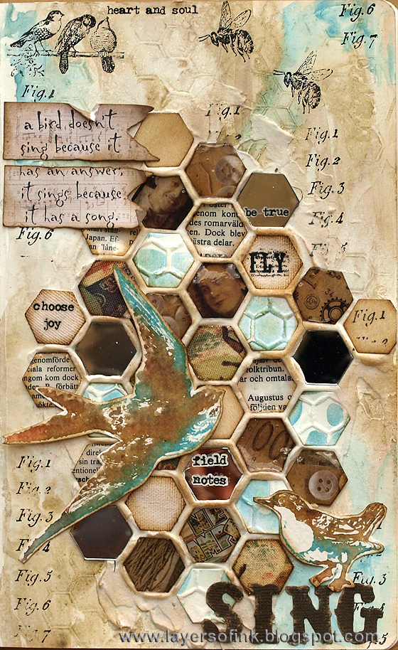
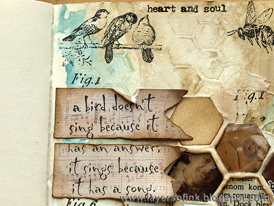
 I made an art journal page, but the technique works just as well on a card, tag or scrapbooking layout. I thought it would be fun to use the Frameworks die to get a mosaic look. A great base for that is Wendy Vecchi's Embossing Paste, which works both as adhesive and grout in this project. The Frameworks die that I used is the Honeycomb one, but you can get the same effect with any of the other Frameworks dies.

Layers of ink - Frameworks Mosaic Tutorial by Anna-Karin
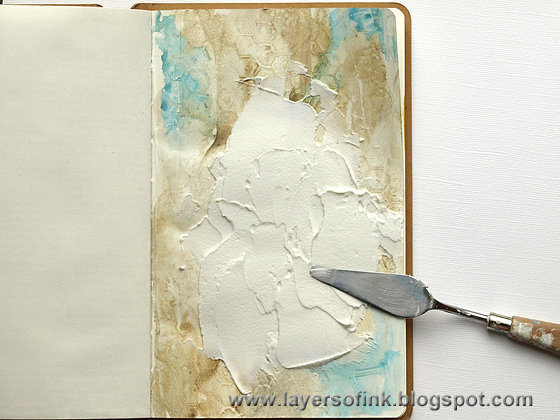
I worked in my Small Creative Journal and smeared gesso with a palette knife. A piece of paper had been embossed in the Honeycomb embossing folder and I pressed it repeatedly into the gesso to make a soft textured pattern. You can also use the embossing folder itself, but then you have to clean it immediately. I also wanted the random gesso effect on the embossed paper. Leave to dry.

Layers of ink - Frameworks Mosaic Tutorial by Anna-Karin
Water down some Distress Paint and paint the page. Mist with water for even more texture. Leave to dry.

Layers of ink - Frameworks Mosaic Tutorial by Anna-Karin
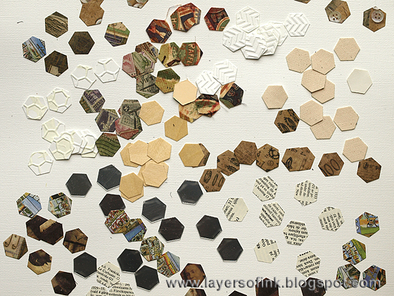
Die cut Honeycomb Frameworks from different papers and materials. I used: natural sticky-back canvas, Mirrored Sheet, wood veneer paper, dictionary paper, the embossed honeycomb paper from earlier, Eclectic Elements Fabric which had been glued to cardstock and various Tim Holtz patterned papers. These are the inside pieces, I will use the frame pieces in a tutorial soon.

Layers of ink - Frameworks Mosaic Tutorial by Anna-Karin
Ink the edges.

Layers of ink - Frameworks Mosaic Tutorial by Anna-Karin
Ink the honeycomb embossed paper with Tumbled Glass and wipe off with a moist cloth. The random spots of gesso resist the ink.

Layers of ink - Frameworks Mosaic Tutorial by Anna-Karin
Smear Embossing Paste on your page in a medium thick layer.

Layers of ink - Frameworks Mosaic Tutorial by Anna-Karin
Start placing your honeycomb pieces into the paste, leaving the same space between all the pieces. The paste doesn't dry too quickly, so you have enough time. I made sure to vary the materials. Press the pieces down a bit to make the paste come up in between them.

Layers of ink - Frameworks Mosaic Tutorial by Anna-Karin
Continue until you have covered the paste. I left some paste uncovered because I thought it gave a cool look. Leave to dry.

Layers of ink - Frameworks Mosaic Tutorial by Anna-Karin
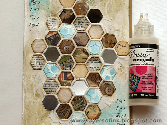
Cover all the paper pieces (not the mirrors, wood, canvas, fabric or embossed paper) with Glossy Accents. This gives a great glossy look to them and even more interest and variation to the mosaic pieces. Leave to dry.

Layers of ink - Frameworks Mosaic Tutorial by Anna-Karin
Ink the paste here and there with Gathered Twigs.

Layers of ink - Frameworks Mosaic Tutorial by Anna-Karin
I stamped the background with a few Tim Holtz stamps. Here you can see the honeycomb texture in the gesso.

Layers of ink - Frameworks Mosaic Tutorial by Anna-Karin
The sentiment was stamped on two Ribbon Flags. The stamp comes from a Darkroom Door set.

Layers of ink - Frameworks Mosaic Tutorial by Anna-Karin
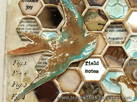
I added rub-ons to some of the tiles. The combination of different surfaces in the tiles makes for a very interesting project. The mirror pieces look like real mirrors (they are hard to photograph).

Layers of ink - Frameworks Mosaic Tutorial by Anna-Karin
I just got Tim Holtz Bird Feather set and wanted to ink up this great bird stamp. It was inked with Broken China and Gathered Twigs, misted with water four or five times and stamped on watercolour paper.

Layers of ink - Frameworks Mosaic Tutorial by Anna-Karin
The little bird is a Hero Arts stamp and was stamped in the same way as the larger one. The title was die cut with the Vintage Market Sizzlits die.

Thank you for looking!

Have a great weekend, I hope you get some time to be creative.

Anna-Karin

Supplies (affiliate links used):