Hello everyone! This week we are all about colour and colouring at Simon Says Stamp and Show, with our challenge 'Colour Love'. Don't miss all the tips and tricks from the design team members this week.
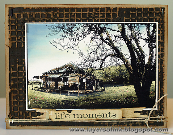
I did a colouring tutorial, using one stamp and colouring it with six different mediums: dye ink, watercolour paint, watercolour pencils, alcohol inks, coloured pencils and distress markers. I wanted to show that you can achieve both different and similar results with the colouring medium you have at hand, and decided to use similar colours on all the examples. I ended up making eight cards. Let's get started:
Dye ink on glossy cardstock:
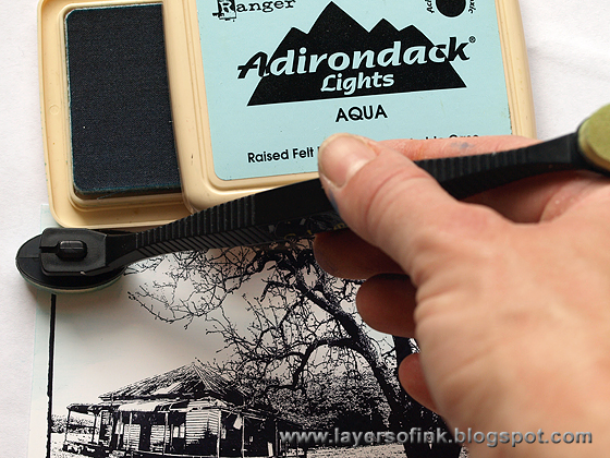
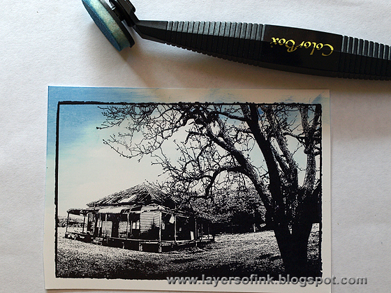
This layer of ink is very light, and that is what we are looking for, it gives a base for the other darker inks.
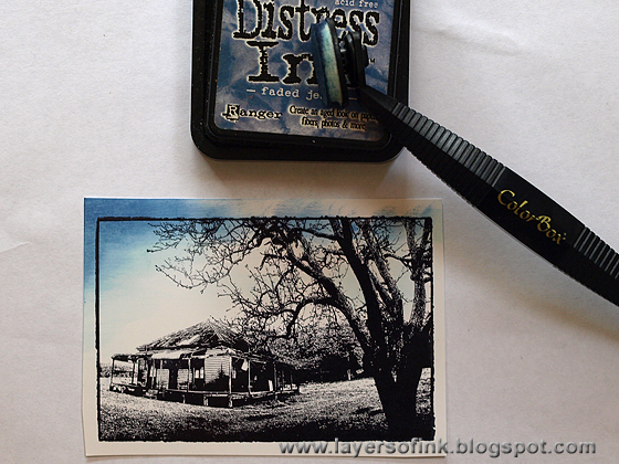
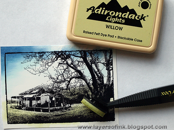
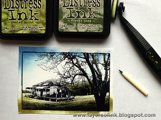
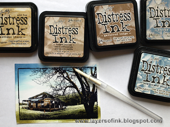
To colour the cottage, I used brown inks for the cottage and blue inks for the tinned roof, using the same principle of starting with the lightest ink: Antique Linen, then Frayed Burlap, Gathered Twigs and Walnut Stain. I used the craft nib on the cottage to create the look of wood planks. Here you can see it with its holder, making it a great tool for the tiny places.
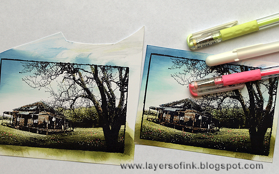
After the ink dried, it goes a bit paler, and I like to go over it again with some of the colours, to give it more punch. After that, I often add highlights and flowers with gel pens, which can really bring life to a scene. I made two of these.
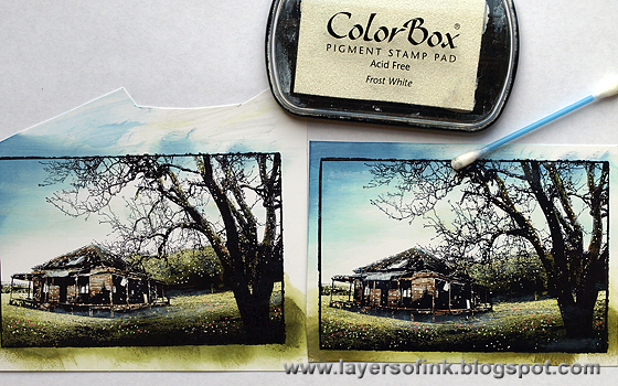
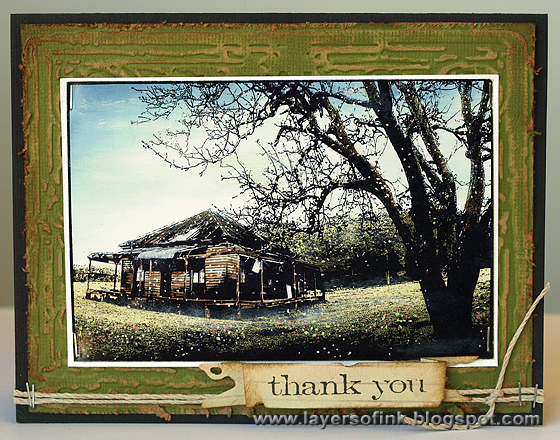
The second finished glossy card, I mounted the scene on a white mat.
Distress Markers on Specialty Stamping Paper:
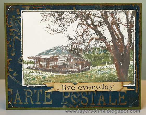
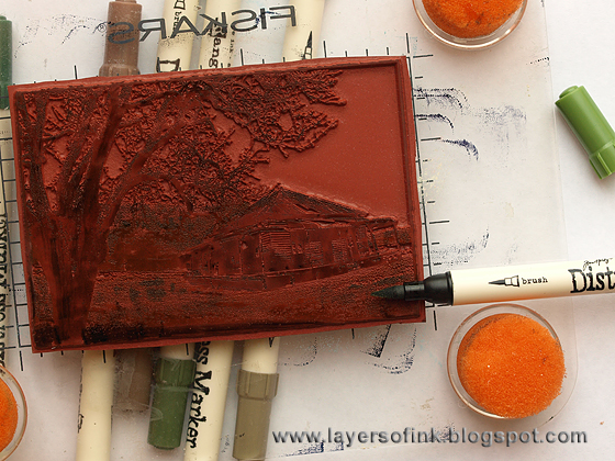
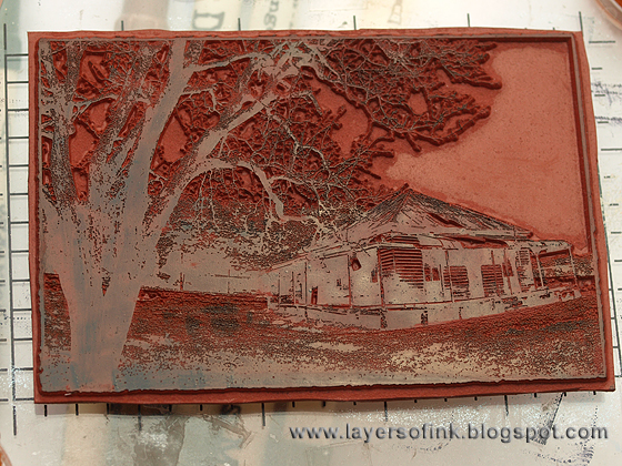
To make sure you have applied ink everywhere, hold the stamp up at an angle to the light and make sure it is shiny everywhere.
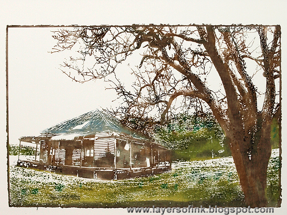
Alcohol ink on acetate:
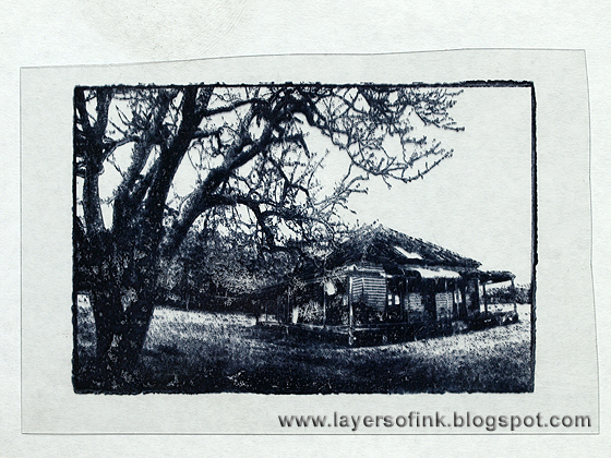
Stamp the cottage on acetate or clear packaging with Archival Jet Black or Stazon Jet Black ink.
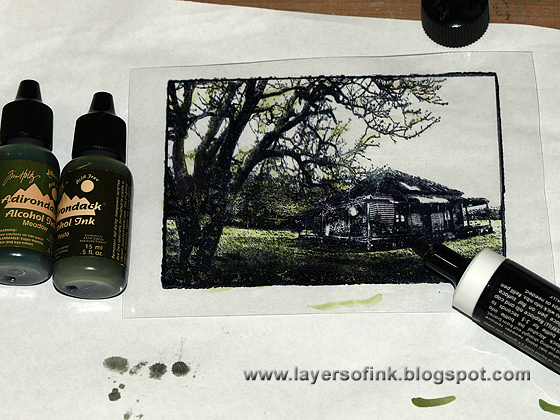
Turn the acetate around, since the stamped image will smear if you apply alcohol inks on top of it. I used an Ranger alcohol fillable marker to apply the ink. I only have one pen, so I dropped a few drops of each colour alcohol ink into a palette and picked the ink up from there. To get lighter colours, also pick up a bit of ink blending solution. Also use ink blending solution to clean the nib between colours, but if you start with the lightest colours, this is only necessary when you switch between different colour families.
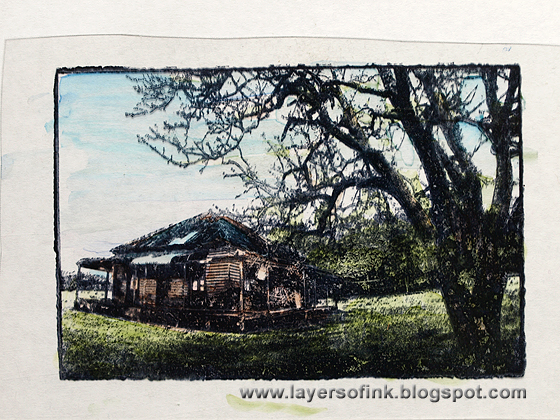
The finished scene, I listed all the inks I used in the supply list.
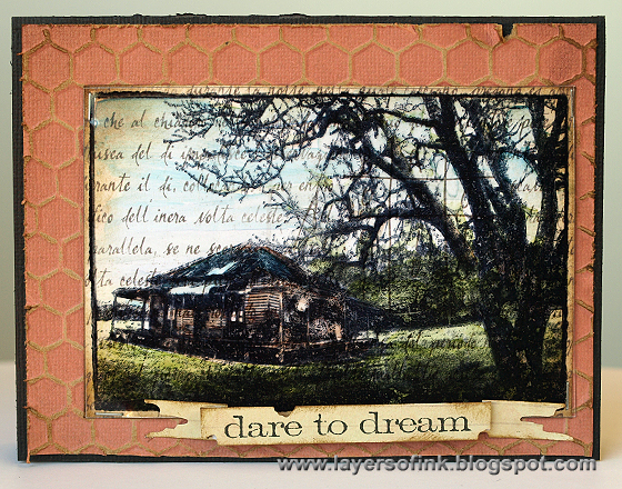
The finished alcohol inked card. I mounted the acetate panel on script paper, since it wouldn't have looked good directly on the kraft-core background.
Watercolour paint on watercolour paper:
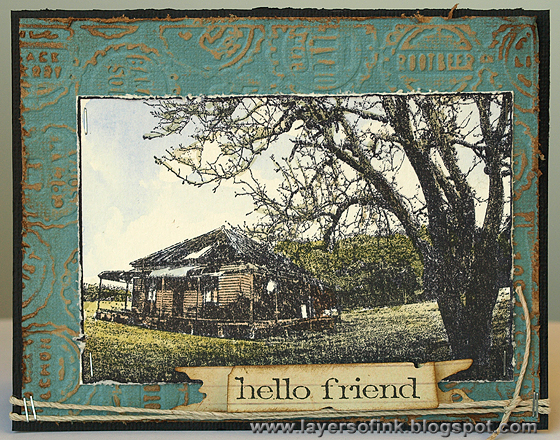
I stamped the image on watercolour paper. Because the paper is textured and this is a detailed stamp, the texture shows through the stamping.
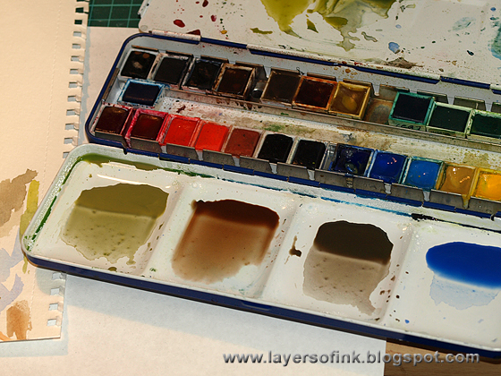
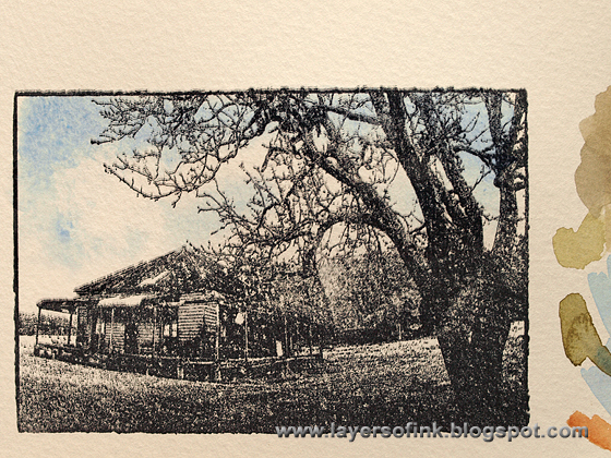
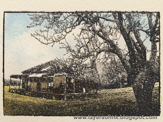
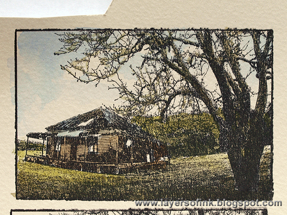
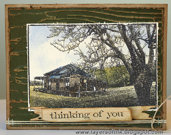
Watercolour pencils on smooth paper:
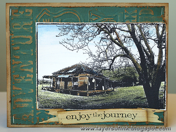
For this card, I stamped the image on smooth white paper and coloured with watercolour pencils. After colouring, I used clean water and a paint brush to create a watercolour look. I took care not to use too much water and not to go over an area many times, since this paper would not be able to handle that much water.
Coloured pencils on smooth paper:
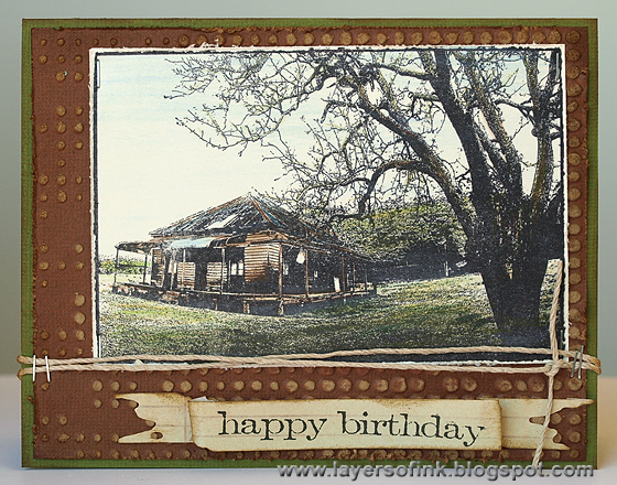
The final card was stamped on smooth cream cardstock and coloured with coloured pencils. I blended the colours slightly with a white pencil and an eraser.
To finish all the cards, I stamped a sentiment from Tim Holtz Simple Sayings set (love it), on Tattered Banners that had been die cut from ledger paper. Each card got a different sentiment. For the backgrounds, I embossed kraft-core cardstock in different embossing folders and sanded to reveal the kraft.
Join us this week and show us projects of one or more methods of applying colour and you could be the lucky one to win a $50 gift voucher from our great sponsor Simon Says Stamp.
Happy colouring!
Anna-Karin
Supplies:
Stamps: Darkroom Door Country Cottage; Stamper's Anonymous Tim Holtz Simple Sayings
Embossing folders: Sizzix: Bottlecap & Rulers, Bricked & Woodgrain, Bubble & Honeycomb, Bookcovers, Distressed Frame & Postal, Dot Matrix & Gridlock, Travel Signs Set
Dies: Sizzix: Tattered Banners
Ink: Ranger Archival Ink Jet Black; Adirondack: Aqua, Stonewashed, Willow; Distress Ink: Stormy Sky, Peeled Paint, Forest Moss, Walnut Stain, Faded Jeans, Antique Linen, Gathered Twigs, Frayed Burlap; Colorbox Frost White
Markers: Distress Ink markers: Frayed Burlap, Vintage Photo, Walnut Stain, Forest Moss, Shabby Shutters, Peeled Paint, Pine Needles, Weathered Wood, Stormy Sky
Alcohol ink: Ranger Adirondack: Lettuce, Pesto, Meadow, Stonewashed, Sailboat Blue, Latte, Ginger, Espresso, Ink Blending Solution
Surfaces: Ranger Glossy cardstock; Ranger Specialty Stamping paper; Core'dinations Tim Holtz kraft-core cardstock; acetate; Neenah Solar White cardstock; watercolour paper; 7Gypsies Postale Ledger 8x8 paper pack
Embellishments: Hemptique natural hemp twine
Pencils and Paint: Derwent Artist coloured pencils; Derwent watercolour pencils; Daler & Rowney watercolours
Tools: Colorbox Stylus Tool; Tim Holtz mini attacher; Ranger Alcohol ink fillable marker, Ranger Craft Nibs, Ranger Craft Nib Holder


Fantastic cards n coloring and Such a detailed tutorial !Thanks for sharing combination of different type of colors on various papers ,it is very helpful for starters like me.
ReplyDeleteThese are so beautiful! It's amazing how different the same stamped image looks based on your coloring techniques.
ReplyDeleteWhat a fantastic exploration of the colouring mediums, Anna-Karin, with your always impeccable technique and attention to detail... a wonderful, inspirational, informative post - thank you!
ReplyDeleteAlison x
Beautiful scene! Love your tutorial showing the different types of coloring you can do and how it looks. Love them all!
ReplyDeleteFabulous scenes and cards! Thank you for this amazing tutorial on different inks and papers- very very informative!
ReplyDeleteAnna Karin...your card...actually all of them are gorgeous. I love the variance in colors and applications that you've so beautifully done on this post. Thank you for the in depth tutorial. I learned alot! I love your techniques. This card is absolutely gorgeous. I so love how you've blended the colors to create such a serene scene. <3 Candy
ReplyDeleteWhat a fantastic tutorial Anna-Karin! I love all of the cards you made and especially love the snowy look of the first card using the white pigment ink! Thanks for sharing your ideas :)
ReplyDeleteThey are ALL so very beautiful. Thanks for explaining all the details!
ReplyDeleteMajo
Fabulous tutorial and wonderful colouring techniques. Absolutely love your scene and the different colouring techniques . Wonderful. Tracy x
ReplyDeleteamazing how you show it to colouring.
ReplyDeletethank you for that.
you made beautiful cards with the stamp and different technique.
wow, really great done.!
Really beautiful coloring, Anna-Karin! I love the way you framed these pieces too, so cool!
ReplyDelete*mwah*
Steph
Simon Says Stamp!
Awesome work! Love all of your different ideas for this image. Also love the cards you made with this stamp. I just had to come on over to your blog after seeing you on Simon Says Stamp. Thanks for sharing.
ReplyDeleteKatie B.
Ohh Anna-Karin! This is amazing! All the different ways of coloring in that stamp! You're so good at all those techniques! Fabulous! Thanks for the detailed tutorials! Hugs, Sandra
ReplyDeleteReally fabulous cards! They all turned out wonderfully.
ReplyDeleteWhat a wonderful tutorial. This was very helpful. Thank You for sharing.
ReplyDeleteTHANK YOU!
ReplyDeleteThis is wonderful, appreciate you taking the time to share all these tips with us!
Sandra ltb
Thank you for wonderful information and beautiful inspiration!
ReplyDeleteOk, you are AMAZING!!! I seriously thought it was a photograph when I saw it on the SSS blog. I was baffled. You are one very, very talented lady!!! Holy cow, these are just mind boggling good! :)
ReplyDeleteWOW!
ReplyDeleteYou are such a talent and wealth of information Professor!!! I love all the different samples here and different media you used for the color! The image is fabulous and your coloration of it is exceptional! You spin a scene like no one else! KUDOS!!!!
ReplyDeleteTotally stunning! And thanks for the detailed tutorial!
ReplyDeleteyou just blow me away - every. single. time!
ReplyDelete