Saturday, June 8, 2013

CSI case file #75 - Travel

Hello everyone! This week we have a lovely case file at CSI:Color, Stories, Inspiration, with soft colours:


I made a layout with two pop-ups using Karen Burniston's new Sizzix Journey collection. Love to hide little surprises on layouts with pop-ups, and they add such a fun interactive element, and more space for photos and journaling.
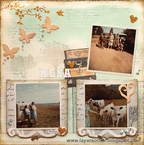
Travel Pop-Up Layout - Layers of ink
I had just developed some photos my dad took with his very first camera, on a rare road trip that he took with my grandmother and uncle. I love these photos, and the colours of the case file fit them very well. From the evidence I used: distressing, jewels, lace, hearts and gold. For the journaling, I asked my dad what he remembered from this trip and he wrote quite a long piece of memories about the places they went to, the car, his camera, the people they saw, etc. It is printed on piece of paper and tucked behind the layout. I added some jewels to the journaling.

For the background, I used watercolour paper and mixed a thin wash of the mint colour. The paper was painted with clean water first and then I added the colour. A bit of random stamping was done on top.

I love this photo which was taken before they drove off, with the car all packed. My dad and his brother are looking at a map, I think. My grandmother is chatting to a relative. The suitcases from Darkroom Door Nomad set were stamped on cream cardstock with Archival Jet Black ink. One was inked peach and the other pink.

I applied Wendy Vecchi's gold embossing paste through a stencil. It dries to a gorgeous gold finish. The Journey butterflies were die cut from mat board, inked with Adirondack Salmon and Victorian Velvet Distress Ink and coated with Glossy Accents.

The Darkroom Door Trees were stamped with Versafine Smokey Grey and the title letters were die cut from white cardstock.

Both the flaps open to reveal a super fun suitcase pop-up. The flaps themselves were die cut from Tim Holtz French Industrial paper with the new Square w/Ornate Edge Card, a new pop 'n cuts base die. The Suitcase pop-up insert was placed inside the Square w/Ornate Edge and die cut from cream paper. The paper was inked with Salmon Adirondack and Victorian Velvet and Antique Linen distress ink, and stamped with various Darkroom Door stamps. I used the new Postage Stamp for the background here, more trees and script.

There is an accompanying Bigz Suitcase die, which die cuts the suitcase again (leaving a thin mat), the handle, corners, little tag and cute ribbon. Love it! I had so much fun embellishing my suitcases. The suitcase was die cut again from cream cardstock and inked with Evergreen Bough. I stamped it with a map stamp and added some journaling stamps too. The handle, corners, and ribbon were die cut from natural sticky-back canvas and inked with Gathered Twigs. The little tag and buckle were die cut from cream cardstock and the buckle was inked with Tarnished Brass Distress Stain.

I wanted to make little signposts, since that fit with the topic of my layout. The posts could not be high since then they would show when the pop-up was closed. I made the posts with the Flagpost w/Lantern & Sign die, but instead of using a sign shape, I die cut small arrows and stamped a word on top. They were attached to the post with jump rings.

I love this sentiment from the Darkroom Door Tree set and stamped it on white paper, die cut with the new Wavy Labels Framelits.

This is the front of the pop-up, with a photo that fit real well together with the quote above. All the edges were inked with Gathered Twigs.

Here's the left-hand pop-up, using different stamps on the background. I switched the main stamp on the background and the suitcase, so while the Postage Stamp is used on the background on the other pop-up, I used it on the suitcase here.  

By mistake, I die cut the little tag from a paper that had stamping at the back, but it was a happy mistake, love the partial clocks. The buckle and handle were inked with Salmon, the rest of the suitcase was done in the same way as the other one.

I made another signpost, but stamped the arrow with a different journaling stamp, from Venetian Vol. 1.

Another quote from the Tree set, stamped on another die cut Wavy Label, a great shape for a little label. The hearts were die cut from mat board with the Flower & Heart die, which is a new favourite of mine, cutting five hearts at once. I smeared gold embossing paste on top.

At the front of the pop-up, I adhered another photo, a piece of lace trim and journaling stamps.

Here you can see both pop-ups open side by side, with the arrows pointing in different directions.

And a view from the top, to show you the pop-up mechanism. Love this suitcase die, it is great to use for anything travel related, or would work great on, for example, a Father's Day card.

Thank you so much for the visit! Have a great weekend!

Anna-Karin

Supplies:
Dies: Sizzix: 3-D Suitcase pop-up, Suitcase Bigz, Butterflies, Flower & Heart, Wavy Labels Framelits, Square w/Ornate Edge Card, Flagpole w/Lantern & SignVintage Market, Mini Old Jalopy & Arrow, Torn Notebook On the Edge
Stamps: Darkroom Door: TreesNomad set, Venetian Vol. 1., New York Vol. 1New York Vol. 2,  Postage Stamps, French Script, World Map; Stamper's Anonymous: Tiny Things
Surfaces: Sizzix Little Sizzles mat board; Tim Holtz Idea-ology French Industrial paper stash, Daler & Rowney watercolour paper; Neenah cream smooth cardstock; Claudine Hellmuth Natural Sticky-Back canvas
Ink: Ranger Archival Ink Jet Black; Distress Ink: Gathered Twigs, Antique Linen, Evergreen Bough, Spun Sugar, Victorian Velvet; Adirondack: Salmon; Versafine Smokey Grey
Paint: Daler & Rowney watercolours
Stain: Distress Stain: Tarnished Brass
Medium: Wendy Vecchi Stamper's Anonymous Gold Embossing Paste
Stencil: The Crafter's Workshop: Mini Cherry Blossoms
Embellishments: Tim Holtz Idea-ology jump rings, Chit Chat stickers; lace trim; rhinestones; pearls

Friday, June 7, 2013

Musical Cherubs Darkroom Door

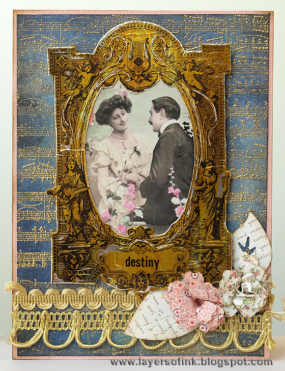
Today I have two cards to share using the new pretty Musical Cherubs Frame Darkroom Door stamp. This stamp can be used as a frame, to hold a picture or a sentiment, or use only a little part of it to create something entirely different.


Check out the Darkroom Door blog to see the wonderful projects some of my team mates made with this stamp. My first card: 

Musical Cherubs 1 - Layers of ink
I wanted a gilded frame and covered a piece of cardstock with foil tape. I painted the tape with Tarnished Brass Distress Paint and when dry, stamped the frame on top. Because I was a bit impatient, the paint was not entirely dry and the stamp pulled a little bit of it off, which created a nice distressed look. I distressed the frame more with a needle tool. The sentiment comes from New York Vol. 1.

For the background, I gold embossed the Sheet Music Background stamp on a piece of cardstock which had been inked with Chipped Sapphire and Tarnished Brass Distress Stain.

You might see the metal of the gold frame better here. I thought the images from Love Letters Photo Chips worked perfectly inside the frame.

The flowers were made with the Sizzix Bloom w/Leaves 3-D Flower die.

Musical Cherubs 2 - Layers of ink
For my second card, I paired up the Musical Cherubs stamp with Tim Holtz Sizzix Cameo Frame die, which has the same shape. It was die cut from patterned paper and the frame was stamped on top with Ranger Archival Jet Black ink. I placed a silhouette die cut from natural sticky-back canvas in the frame and embellished the card with paper clay letters and a flower. The background is dry embossed kraft-core cardstock.

Thank you so much for looking!

Anna-Karin

Supplies for both cards:

Darkroom Door products:
Paper Products: Love Letters Photochips

Other products:
Surfaces: Core'dinations Tim Holtz kraft-core cardstock; Ranger Manila cardstock. Foil Tape Sheets; My Mind's Eye Howdy Dowdy 6 x 6 patterned papers; foil tape
Embossing folder: Sizzix: Eiffel Town & French Script Set
Ink: Ranger Archival Jet Black; Distress Ink: Gathered Twigs; Tsukineko Stazon Jet Black
Stain: Ranger Distress Stain: Chipped Sapphire, Tarnished Brass
Paint: Ranger Distress Paint: Tarnished Brass
Embellishments: Martha Stewart clay and mould kits; pearls; trim


Thursday, June 6, 2013

Picket Fence Birdhouse

Hello everyone! I was very happy to make samples for Eileen Hull for winter CHA, using her Sizzix Picket Fence collection. I have been wanting to share these projects ever since then, but decided to wait until the dies were available. You can see the whole wonderful Picket Fence collection here.

First up is a cute birdhouse:

Picket Fence Birdhouse - Layers of ink
You might already know that I love to make little houses, and this one was no exception. It was die cut from white mat board, and since it is a Scoreboards die, it both cuts and scores, making assembly very easy. The house was inked with Barn Door and Aged Mahogany (mat board takes ink very well). For texture, I stamped the Tim Holtz alphabet stamp with Aged Mahogany, holding it in my hand instead of mounting on an acrylic block, for a random impression.

The sentiment was white embossed so that it would really stand out. It is very easy to get the white edges of the houses, after inking, simply sand off the ink around all the edges. I embellished the house with pearls and wood veneer birds.

Bird stamps are of course perfect for a bird house. The Dylusions birds were stamped and cut out, and the branch, from Tim Holtz Urban Tapestry set, was stamped with Archival Jet Black ink.

On this side of the house, I stamped a small bingo stamp, which was just the right size, also with Archival Jet Black. The ticket was stamped on a scrap piece of ledger paper and cut out. I also added two game spinners, simply because I love arrows. The house was embellished before assembly, making it easy to add brads and staples.

The back of the house, with two sweet Dylusions birds white embossed.

The roof of the house has a really nice texture. I first painted it black and then covered the whole roof with embossing ink. It was sprinkled with Ranger's Cement embossing powder and then I flicked it quite hard at the back, so that some of the powder flew off. Melt the powder with a heat gun. The roof was embellished with more birds, and a heart ribbon.

This would be great as a gift to someone who loves birds or little houses If you use different sentiments and embellishments it can work for many different themes.

Thank you for the visit!

Happy crafting!

Anna-Karin

Supplies:
Dies: Sizzix 3-D Birdhouse
Stamps: Stamper's Anonymous Tim Holtz: Going Somewhere, Urban Tapestry, Mini Muse; Dylusions Dyan Reaveley Birds on a Wire
Surfaces: Sizzix Little Sizzles mat board white 6 x 13; 7 Gypsies Lille ledger 8 x 8 paper pad
Ink: Distress Ink: Barn Door, Aged Mahogany; Archival Ink Jet Black; Ranger Emboss-It Dabber; Versamark
Paint: Adirondack Pitch Black
Embossing powder: Ranger: Cement Embossing Antiquities, Seafoam White
Embellishments: Tim Holtz Idea-ology: Game Spinners, Long Fasteners; Studio Calico wood veneer Birds; Panduro heart ribbon; pearls

Monday, June 3, 2013

Projects that WOW Blog Hop

Hi everyone and welcome to my blog! [This is my second post for today, if you are here for my Simon Says Stamp & Show post, it is below.]


I was happy to be asked to be a guest contributor for Jennifer Grace's Projects that WOW online class. Here is some info from Jennifer about the class:

"Projects that WOW!’ is about making your projects stand out from the crowd. What makes you pause and look closer at a scrapbook page when you are flicking through your own albums, or looking at other people’s layouts in magazines? Which cards jump out at you from Pinterest or from envelopes when you open them? What details of paper-crafted home décor or jewellery make you stop and say ‘wow!’? It’s time to learn some of these techniques or styles and put them to use!

This blog hop includes a giveaway for three class places (worth £10 each). To enter you just need to comment anywhere on the ‘Projects that WOW!’ blog hop by 11.59pm BST Thursday 6th May. EACH COMMENT on EACH BLOG in the hop counts as an EXTRA ENTRY into the draw. The winners will be announced at Jennifer Grace Creates on Friday 7th June. If you’ve already purchased a class place and then you win, the class price will be refunded to you. So don’t wait to sign up! Go HERE to buy a place now!'

Sounds like a lot of fun doesn't it! And the list of guest designers is very impressive too.

If you stop by my blog often, you know that I love pop-ups, and you can be sure to find some on my layout (using Karen Burniston's brand new Sizzix Journey dies), there is also a lot of techniques, stamping and ink of course. Here is a little sneak peek of my layout.

 
If you encounter a broken link, and to find out more about the class, head over to Jennifer's site.

The next stop in the blog hop is the fabulous Natalie Elphinstone.

Thank you for stopping by! Don't forget to leave a comment for your chance to win a spot in the class.

Happy crafting!

Anna-Karin

S is for Simon Says Stamp & Show

Hello! First, a big thank you to everyone who commented on my forest tutorial last week on the Simon Says Stamp & Show blog. This week we have a another fun challenge for you, with lots of possibilities, 'S is for...', anything you can think of that is inspired by 'S'.

Once I started thinking, I couldn't just stop at one item, and this layout was inspired by: stamps, Stamper's Anonymous, Sizzix, stencils, scrapbooking layout, sentiments, Salty Ocean, Squeezed Lemonade:

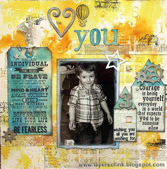
I wanted to use some great Tim Holtz sentiment stamps to give an important message to my son on this layout. The large sentiment on Way with Words set is the perfect size for a tag and two more sentiments were displayed on Artful Dwellings houses (one of my favourite dies). I used watercolour paper for the background and applied molding paste through a Mini Numerals and Mini Mosaic stencil. When the paste was dry, the paper pressed into Squeezed Lemonade and Wild Honey Distress Ink, on my craft sheet, first misted with water. Then I added some stamping with Tim Holtz stamps. Love the new Tiny Things set, I like such small details.

This is such a great sentiment stamp. I dragged a piece of manila cardstock through Distress Inks (Salty Ocean and Peacock Feathers) smeared on my craft sheet and misted with water. When it was dry, I misted with white Dylusions ink, for a great chalky effect. The tag, title letters and roofs were die cut from this piece of paper, and inked around the edges with Black Soot. Three small wood veneer stars were painted with Picket Fence Distress Paint and glued to the tag. I twisted tissue tape together to tie it with.

The heart was die cut from grungeboard and coloured with Brushed Pewter Distress Stain, and the large letters were die cut with the Word Play die. I also added strips of tissue tape here and there, picking words that fit the layout.

I love the little bird stamp. The star was die cut from white cardstock.

I painted Picket Fence Distress Paint around the edges of the photo and die cut the photo mat with the Torn Notebook On the Edge die. After die cutting the houses from mat board, I covered them with strips of tissue tape (you can use grungeboard too) and then added several layers of Picket Fence Distress Paint, letting it dry in between. This paint is perfect for a white wash effect. The roofs were die cut from left over inked manila paper and also die cut with the Torn Notebook die. Sentiments were stamped on top and one of the houses got a curtain. This photo was taken on my son's third birthday, so I added a Cargo Stencil Number 3, and also some gears. They were die cut from grungeboard and coloured with Brushed Pewter Distress Stain, which is such a quick way of getting a metallic effect.

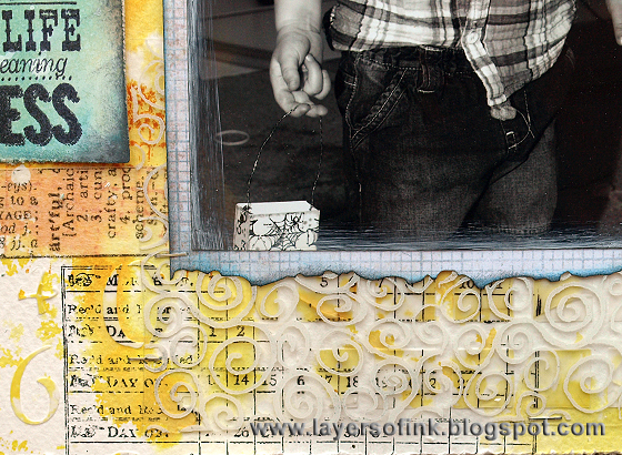
I had a piece of acetate on my desk which had been stamped with a Tim Holtz swirl stamp and white Stazon ink, and decided to add that to the layout for an additional layer. Do you spot the little spider bag in his hand? It comes from this tutorial of mine and is now used as a little handbag, mainly storing coins that have 'fallen' (with a bit of help) out of my handbag.

Join us this week and you can be the lucky one to win a $50 gift voucher from our fabulous sponsor Simon Says Stamp (lots of 'S' inspiration here!).


Thank you for the visit!

Happy Crafting!

Anna-Karin

Supplies:
Dies: Sizzix: Artful Dwellings, Mini Openings, Tag & Bookplates, Mini Gears, Cargo Stencil Numbers, Word Play, Heart & Label, Star & CircleTorn Notebook On the Edge
Surfaces: Tim Holtz Idea-ology: Grungeboard; Ranger manila cardstock; 7 Gypsies Ledger Postale 8 x8 pad; watercolour paper
Stamps: Stamper's Anonyous Tim Holtz: Tiny Things, Way With Words, Words for Thought, Tiny Textures, Ultimate Grunge, School DeskWarehouse District; Hero Arts: Printer's Lowercase
Ink: Distress Ink: Squeezed Lemonade, Salty Ocean, Peacock Feathers, Black Soot, Wild Honey; Ranger Archival Jet Black; Stazon Cotton White
Paint: Distress Paint: Picket Fence
Stain: Distress Stain: Brushed Pewter
Mist: Dylusions: White Linen
Medium: Golden Molding Paste
Stencils: The Crafter's Workshop: Mini Numerals, Mini Mosaic
Embellishments: Tim Holt Idea-ology: Symphony Tissue Tape, Crinkle ribbon; Studio Calico wood veneer Tiny Stars

Sunday, June 2, 2013

Deer in Birch Forest

Hello and welcome! A new month and a new challenge theme at Craft a Scene, 'Forest Animals'. So do a scene which includes any kind of forest animal, from your own area or elsewhere.

I use my small animal stamps a lot, but sometimes forget about the larges ones, so I challenged myself to use some of them this month.

For this week, I did a watercolour card featuring a cute Sutter deer stamp. I love seeing deer in the forest and I am also particularly fond of Birch trees. The trees and deer were stamped on watercolour paper with Archival Jet Black Ink. To make it easy to stamp the grass and paint the sky and grass, I painted the trees and deer with masking fluid. When it was dry, the grass texture was stamped. To paint the sky, I first painted it with clean water and then dropped blue watercolour paint into the sky. The grass was painted in a similar way, but I added some dry-brushing and painted extra grass and also shadows (once the first layer of paint was dry). By making the grass darker and warmer in the front of the scene you add a feeling of perspective.

Finally, I painted some highlights and flowers with white acrylic paint and stamped the leaves in the left hand corner.

Thank you for looking! I hope you will join us this month!

Anna-Karin

Supplies:
Stamps: Stampscapes: Ducks in Formation 027A, Sedge Filler 251C, Twisting Leaves Sm., Birch Tress 312I, Birch Trees Sm. 313G; Sutter: Fawn
Ink: Ranger Archival Jet Black
Paint: Daler & Rowney watercolours; Adirondack Snow Cap
Surface: Daler & Rowney watercolour paper
Medium: Daler & Rowney masking fluid
Embellishments: twine

Saturday, June 1, 2013

CSI case file #74: Many miles

Happy Saturday! We have a cheerful case file at CSI: Color, Stories, Inspiration this week:


I had a raspberry and black bike when I was a teenager and thought that was a great topic for this week's layout.

CSI case file #74 many miles - layers of ink
I am very fond of cycling and this is not the first layout I have done about it, but it is the first one about this particular bike, which was my first adult-sized bike. From the evidence I used metal and beads and I documented a childhood/teenage memory. I had this bike for many years, it took me back and forth to school, sport activities and friends every day, it went on a memorable bike holiday to Denmark, I was hit by a car while cycling on the bike once (no serious injuries luckily), it took me to forests, lakes and the sea, on a yearly race together with my dad and so much more. I typed a long piece of journaling and printed it on cardstock which was folded over to form a flap photo mat.

The circles on the background were done by applying Coarse Molding Paste through a stencil with a palette knife and leaving it to dry. Then I painted on top with Picked Raspberry Distress Paint.

Beads were one of the items in the case file and that made me remember the Glass Bead Gel I got not long ago. I tinted it with yellow paint and smeared through a brick stencil. It looks real nice in real life and catches the light in a great way, but hard to capture on a photo. The left-over gel was smeared at the base of the layout, to create a feeling of speed.

This is my favourite detail on the layout. I wanted a cool bike accent and was looking through my stash to see if I could find something. I came up on one of Tim Holtz Sprocket Gears and realised they looked like bike wheels, but the bike needed a body too. Can you see what I used? It's a Tim Holtz Clothes Hanger Clip, I just bent out the top. The wheels were painted with Black Soot and Brushed Pewter Distress Paint and the body with Picked Raspberry and Black Soot. I hammered the brads in the centre of the wheels to give them more texture.

The bikes at the base of the layout were done by sponging paint through a Prima stencil, because of the bead gel texture, the images are a bit fuzzy, but I thought that worked well here.

Thank you for the visit! I hope you'll join us this week at CSI.

Anna-Karin

Supplies:
Surfaces: Canson watercolour paper
Stamps: Artistic Outpost: Lovely Day; Hero Arts Sketch Circle; Graphic 45 Antique Typewriter Letters
Ink: Stazon Jet Black; Memento Pear Tart
Paint: Ranger Distress Paint: Picked Raspberry, Black Soot, Brushed Pewter; Golden: Primary Yellow
Stencils: The Crafter's Workshop: Mini Bricks, Mini Circle Regiment; Prima: Bicycle 12 x 12
Medium: Golden Artist Paints: Coarse Molding Paste, Glass Bead Gel
Embellishments: Tim Holtz Idea-ology Sprocket Gears, Game Spinners, Long Fasteners, Hanger Clips; Studio Calico wood veneer bike; Reprint pink rhinestones; pom pom ribbon