Thursday, October 11, 2012

Shadow Box Tutorial

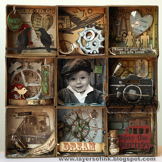
Today I have a fun and pretty long Sizzix tutorial to share with you, using Eileen Hull's Candy Drawer ScoreBoards die, and a lot of other Sizzix dies. I love thinking of different ways to use a die, and most dies can be used for many other things than they were originally designed for. With this Candy Drawer die, I already made a Chest of Drawers and a little gift box, and I also thought it would work great to make my own little divided shadow box with different compartments. Here's the result:
I loved how this project turned out. First, I was planning to make three shelves, but then I added another three and then another three, so that I could place the photo of my son in the centre and fill the others will all kinds of interesting little things. You could make this as big or small as you want to and add any type of small items inside. Here's how I made this:

First, adhere patterned paper to strips of mat board, slightly larger than the box you will cut out. I used multi-medium to adhere the papers, but you could use other adhesives too. When dry, die cut them using the drawer part of the Candy Drawer die (the one that looks like the shapes on the photo). Important: place the mat board with the patterned paper facing up on the die, not facing down as you would normally. This is because we want the patterned paper to be on the inside, so the score lines must face the right way.

Die cut another five pieces from white mat board. Ink them with Stormy Sky, Frayed Burlap and Peeled Paint Distress Ink. Stamp the pieces with Archival Ink Jet Black and Coffee, using stamps that will fit with your projects. I thought these long Tim Holtz Stamper's anonymous stamps worked perfectly, stamped twice to reach all the way around.

Also die cut 9 pieces of mat board of the square, base piece, on the die. These form the back of each little shelf. You don't need to ink them. (I forgot to take a photo of them)

Die cut five squares from patterned paper. The ATC sized papers in Tim Holtz's Idea-ology paper packs were perfect for this since the designs are smaller.

Die cut another four squares for the remaining shelves. I cut two from manila cardstock, one from Specialty Stamping paper and one from a photo. Ink with the same colours used for the mat board, and stamp with images fitting the theme of your project. Now you can start planning which boxes should go together with which square and what items to put in each one. On to the embellishments:

Die cut the fun Birds on a Wire birds from black modeling film, if the die doesn't cut all the way through, just use a pair of scissors to cut them out completely. Cut a heart from Specialty Stamping paper, and from clear modeling film. Ink the paper heart.

Heat the birds and the modeling film heart and shape them a bit. Don't burn yourself. They keep the shape perfectly when cool. Stamp a sentiment on the paper heart and put the clear heart on top with a mini staple.

Cut a number, Mini Old Jalopy, clock and camera from grungeboard.

Paint these pieces. You have to cut off the top part of the clock for it to fit inside the box. Sand the pieces and ink them with Walnut Stain. I coated the clock with Crackle Accents.

Die cut three gears from grungeboard, paint them silver, sand and distress them with a needle tool, then ink them black. I coated the gears and the number 1 with glossy accents.

I also stamped on pieces of mica. The heart was die cut from mica and stamped with a ticket stamp. The clock from the Tim Holtz Stamper's Anonymous Curiosities set fits perfectly inside the mini Alarm Clock die cut. I also added a little piece of mica behind the windows of the car and behind the camera. If you don't have mica, you can use a transparency instead.

I wanted to use a little corked vial and found a bag with tiny washers and small screws that I bought in a hardware store long ago. I aged them with alcohol ink and also gave the same treatment to a bunch of larger washers.

Here you can see some of the embellishments. This was a hard project to photograph because it is so dimensional, so it might be easier to see the embellishments like this.

The metallic embellishments were aged with the new Ranger Vintaj Weathered Copper patina set. The metallic part of the light bulb was distressed with the same alcohol ink colours used for the washers. The 'A' is cut from grungeboard with the Word Play die, painted red and coated with Glossy Accents.

Here you can see the two hearts and a facet, which was glued to an elephant image from the patterned paper. My son loves elephants, so it fit well. The ruler paper was in my box of scraps.

The flowers which have been gilded with UTEE was a left-over from another project (see this post), some larger washers and the little vial with the small washers and screws. The 'a' tag is a Vintaj piece which was embossed in the Lowercase Typewriter folder and painted with the patina inks.

The fun banners is from the Flagpole w/Lantern & Sign die, but I ended up not using them since there wasn't a place where they didn't cover too much in a box. I'll use them on another project instead. The ticket and Tattered Banner was cut from manila cardstock, inked and stamped. The small ticket was stamped and cut out.

Time to assemble everything. If you have pieces that you want to hang from the roof of a box, it is easier to attach them before assembling the boxes. Since the die both cuts and scores the mat board, assembly is easy. First glue the side flaps together, then glue the back mat board square to each piece (no photo of this step). You need to trim the inside paper squares a little bit so that they will fit nicely. Then it is time to adhere all the embellishments. Since some of them are attached to the sides of the boxes, it is better to embellish each box before gluing them all together. 

I used multi-medium to glue all the boxes together, you could use other strong adhesives too. I placed a book on top, to make sure that the glue adhered well. Try to line them up as well as possible, two of my last boxes didn't line up perfectly, but it really didn't matter much.

Cut four strips of patterned paper to glue to the sides of the box, measuring carefully. I also cut a large piece of black cardstock to cover the back of the project.
Finished! Here are close-ups of each box:

I circled the date the photo was taken on the ticket at the floor of this box. The birds were stapled to the sides of the box (sorry they are blurry on this photo). I added some Studio Calico wood veneer embellishments and glued remaining washers here and there.
The little ticket was placed on a pin and I also added a piece of ruler ribbon.
A little wood veneer family lives in this box, together with the heart and this sweet word band quote (blurry, I know, it was impossible to take photos where everything inside the boxes was sharp).

Here's a better view of the flowers.

Love how the mica clock turned out. It was attached with foam dots, three on top of each other, for more dimension.

The focal point of the project. I added a bunch of little items around the edges of this box, not wanting to put anything in front of him.

Guess who loves cars and any type of means of transportation?

I glued a whole bunch of left over little pieces of mat board together and painted them black, this piece was placed behind the camera to give it dimension. Foam dots weren't enough since I wanted the camera at the front of this box. The facet was placed behind it and a piece of stamped mica in front of it.

This is one of my favourite boxes. The mica with the quote fit so well over the old train photo. Lots of washers here, a light bulb and a ticket.

Here you can see the gear, washers and ticket better.

A gear and game spinners were placed in the centre of the compass stamp. The banner was glued to the front of the box (which is why it is out of focus here).

Another gear, layered with a small washer was adhered to the back of this box. The car was attached to the project using the same technique as with the camera.

Here's a better view of the little bottle. Love the look of the old washers inside it.

And a last view of the project from the top.

Thank you so much for looking at this very long post!

Happy crafting!

Anna-Karin

Supplies:
Dies: Sizzix: Candy Drawer ScoreBoards die, Birds on a Wire, Hearts Set, Mini Gears, Mini Old Jalopy, Vintage Alarm Clock & Camera set, Mini Tickets, Tattered Banners, Word Play, Cargo Stencil Numbers, Embossing folder: Sizzix Vintaj Lowercase Typewriter DecoEmboss
Stamps: Stamper's Anonymous Tim Holtz: Stuff to Say, On the Railroad, Road Trip, At the Movies, Mini Muse, Odds and Ends, Going Somewhere, Curiosities, Warehouse District, Artful Voyage, Classics #1, Ultimate Grunge Backgrounds
Inks: Distress Ink: Antique Linen, Frayed Burlap, Walnut Stain, Stormy Sky, Peeled Paint, Old Paper, Black Soot; Archival Ink Jet Black and Coffee; Ranger Vintaj Weathered Copper patina kit; Ranger Adirondack Alcohol Ink: Pitch Black and Caramel
Paint: Ranger Adirondack paint dabbers: Pitch Black, Silver; Jenni Bowlin paint dabber Chili Powder
Surfaces: Sizzix Little Sizzles white mat board; Tim Holtz Idea-ology Lost & Found, Destination paper pads, Grungeboard; Stamper's Anonymous Wendy Vecchi clear and black modeling film; Ranger Manila cardstock and Specialty Stamping paper; US ArtQuest mica
Embellishments: Tim Holz Idea-ology Light Bulbs, Corked Vials, Word Stick, Word Bands, Game Spinners, Sprocket Gears, Mini Gears, Mini screw brads, Film Strip Ribbon, Memo Pins, Philosophy Tags, Facets, Ruler Ribbon, Mini Paperclips; Vintaj Blank Square Tag; Studio Calico wood veneer Birds, Potty People, Tiny Stars, Transportation, Tweets; paper flowers; Collections Elements measuring tape; washers and screws
Adhesive: Ranger Glossy Accents, Crackle Accents; Ranger Claudine Hellmuth matte multi-medium
Tools: Sizzix Big Shot; Tim Holtz mini attacher; paint brush

Monday, October 8, 2012

Rustification Pop-Up card

This week our challenge at Simon Says Stamp and Show is 'rustification' - anything rusty you could think of. Such a fun challenge! I enjoy creating rust in different ways and decided to do a large pop-up card, using Karen Burniston's Sizzix Pop 'n cuts dies and a bunch of Tim Holtz Alterations dies and Stamper's Anonymous stamps.

Here's the front, where someone has been typing a message on a rusty old typewriter:

I wanted it to look as if the typewriter is sitting on a stack of papers that the sender of the card has just finished typing. I used a stack of papers from an old book aptly called The Paper Palace, misted them heavily with Frayed Burlap distress ink reinker, mixed with water, and then also a bit of Biscotti Perfect Pearls mist. The edges were distressed, torn and rolled. When dry, I inked the edges heavily with Frayed Burlap and Walnut Stain, and stamped a coffee stain stamp with Archival Ink Coffee.

The typewriter was die cut from grungeboard and painted black. Then I dry-brushed Juniper, Sail Boat Blue and a bit of silver over it. I sanded it and scratched it with a needle tool. The small parts were painted silver and put back into their place. I did a step-by-step tutorial with this faux-rust technique here.

I recently got the Ranger Rust Antiquities embossing powder, and wanted to try it. I used the new Ranger Clear Emboss It dabber embossing ink and dabbed and swept it over areas of the typewriter where I wanted the powder to stick. The final touch was to place a piece of paper underneath the typewriter that had been stamped with an alphabet typewriter stamp and fill the keyboard holes with glossy accents. I covered the silver parts with glossy accents too.

The background cardstock was stamped with the larger version of the same alphabet stamp, and I stamped a row from the smaller version of the stamp at the top of the message paper tucked into the typewriter. The sentiment was printed on my computer using a typewriter font.

The Heart & Wings die comes from Karen Burniston's pop 'n cuts range. It was cut from grungeboard. The wings were painted silver, distressed, inked with Black Soot and then coated with glossy accents. The outer heart was painted black, and embossed with the rust powder. The little heart was also painted black, but embossed with a verdigris powder instead.

The layers of book pages give a pretty cool feeling to the front of the card and a perfect home for the typewriter. When you open the card, this is what you find:

Love these pop-up cards, they are so fun to make. I made a step-by-step tutorial using this same Winged Hearts 3D die, you can find it here, other pop-up cards include this one and this one, and this layout. I am happy that Simon Says Stamp now carries these dies. I used a Tim Holtz Crowded Attic patterned paper for the cardbase, and turned the patterned side inwards.

I cut a rectangle of manila cardstock and die cut the Winged Hearts pop-up from that, carefully placing it so that the fold would be in the centre of my paper. If you don't have the base die for the pop 'n cuts, you can also use your ordinary base tray. I cut the Winged Hearts pop-up a second time, from eclipse tape (remember to turn the tape so that the sticky side faces towards your cutting pad). Carefully cut the mask out, you will use both the positive and the negative side. Mask the two hearts and the wings. Ink the paper with Antique Linen, Old Paper and Frayed Burlap. Then I misted with Biscotti Perfect Pearls mist.

When dry, the clocks and compass were stamped with Frayed Burlap. The hand was stamped with Archival Jet Black. Then I stamped repeatedly with the larger version of the alphabet stamp. I held the stamp in my hand instead of mounting it on an acrylic block for a more uneven look, and stamped it with mainly second and third generation stamping (I stamped it once first on a piece of scrap paper).

I removed the mask from the hearts and placed the negative mask around them to protect the surrounding cardstock. The hearts and wings were inked with Old Paper, adding a bit of Frayed Burlap. Then I coated them with embossing ink - love the new embossing dabber, it is perfect for these types of techniques. I covered the hearts with the rust power and brushed just a little bit off for a less perfect look. I cut the hearts from book paper, with the Heart & Wing die, which coordinates perfectly with this pop-up die. The sentiment was printed on my computer.

The key and keyhole were die cut from Ranger's shrink plastic, which is the perfect solution when you want a small embellishment. The pieces were shrunk and then coloured with alcohol inks (Juniper, Sailboat Blue, Ginger, Snow Cap), to create a patina look. They were coated with glossy accents on the front.

Here's a close-up of the little heart and of the key. If you didn't know it, it would be hard to guess this key comes from the same die as the large key below.

The key was die cut from grungeboard, painted silver, distressed, inked with Black Soot and coated with glossy accents.

This piece was also cut from grungeboard and was given the same treatment as the typewriter. The word was cut from the book. The edges of the pop-up piece were cut with the Brackets On the Edge die. I matted it on kraft core cardstock.

You see the pop-up mechanism better here. It is so cool and such a fun surprise for the recipient.

Play along with us and show us your rusty creations! As always, Simon Says Stamp gives a $50 gift voucher to one lucky participant.

Sunday, October 7, 2012

Majestic Mountains

Hi everyone! A new month, and a new challenge theme at Craft a Scene, this month we are focusing on Majestic Mountains. I love mountains, especially if there a lake or two nearby and trees.

There is no lake on my scene for today, but quite a bit of magic:

I wanted to ink up the Stampscape's Aurora Borealis stamp, which I have had for a while, but hadn't used yet. The mountains were stamped first, twice, overlapping slightly and making the one somewhat taller than the other. They were stamped with Archival Jet Black ink. I normally only use a torn paper as a mask when I do scenic stamping, but this time I made a mask for the mountains, and then stamped the Aurora Borealis stamp twice behind them, using Archival Ink Library Green. The forest come for the Meadow stamp and was stamped with Jet Black, adding a few extra trees here and there.

The scene is done on glossy cardstock and coloured with dye inks, using a Colorbox Stylus tool. (See this step-by-step tutorial if you are interested in this technique). I started with the lighest shade of yellow and gradually built up colour, making sure to leave some areas on the mountains and in the sky the white of the paper.

Lots of highlights were added with a white gel pen and then mist was created by drybrushing white pigment ink on the scene, especially on the are between the forest and the mountains.

We have four new design team members joining us at Craft a Scene. Very welcome Dora, Sally, Rebecca and Margaret! I am looking forward to seeing all the wonderful scenes. Head over to the Craft a Scene blog to meet them.

Thank you so much for stopping by! I hope you can join us in the challenge this month.

Anna-Karin

Supplies:
Stamps: Stampscapes: Aurora Borealis 001G, Meadow Lg. 057G, Tree Duo 085A, Rocky Peaks 188F, Scenic Sentiments sheet #3
Inks: Ranger Archival Ink: Jet Black, Library Green; Adirondack: Willow, Lemonade, Meadow, Bottle, Lettuce, Pesto, Pitch Black; Jenni Bowlin: Lemon Drops, Seed Packet; Colorbox Frost White
Paper: Kromecote glossy cardstock
Pen: white gel pen

Saturday, October 6, 2012

Too fast: CSI case file #40

Happy Saturday! This week we have a fun and happy case file at CSI: Color, Stories, Inspiration:

And my layout:

From the evidence items I used: ribbon, dots, circular elements, label, transparent stuff, numbers.  I tied a ribbon to my journaling spot and the journaling is about both the happy and the wish and the birthday theme. For the large circle I used a Tim Holtz kraft resist paper which was inked with Peeled Paint Distress Stain using a circular motion. I white embossed some dots and numbers on it and realised that some of the embossing powder got stuck on the resist parts of the paper (where there is a varnish). I thought it looked cool, so instead of brushing it off, I melted the powder. The bird and black circles were stamped with Archival Jet Black ink.

The Tim Holtz crinkle ribbon was dyed with Mustard Seed Distress Stain and Picked Raspberry Distress Ink. The colours blended together a bit, making some of the yellow parts look orange.

The label was die cut with Eileen Hull's Sizzix Labels & Buttons die.

Every year, I use a photo or two from my birthday and do a layout where I write about the year that has past. The journaling is on the tag behind the circle. It is pretty personal normally, as this is one of my most personal layouts every year.

I saw someone else use this clock die to frame a part of a photo, I am sorry I really can't remember where I saw it now. It worked with both the circle and time theme of this layout. I cut it from yellow patterend paper and stamped it with an envelope pattern stamp.

I had used this collage stamp, stamped on acetate, on a previous project and found a left-over one on my desk. It was tucked behind one of the photos.

As you know, I love text and alphabet stamps, this one comes from Wendy Vecchi. I stamped in on a piece of acetate with Stazon Platinum ink.

Here's a close-up of the kraft resist paper.

Thank you for looking! I hope you can join us this week!

Anna-Karin

Supplies:
Stamps: Stamper's Anonymous Tim Holtz Ultimate Grunge Backgrounds, Photograph ATC stamp; Stamper's Anonymous Wendy Vecchi Collectible Art; Hero Arts Envelope Liner Background CG461, circles
Dies: Sizzix Weathered Clock, Lables & Buttons, Tag & Tie
Ink: Distress Ink: Picked Raspberry; Archival Ink: Jet Black
Stain: Distress Stain: Peeled Paint, Mustard Seed; Stazon Platinum
Embossing powder: Ranger Seafoam White
Surfaces: Tim Holtz Idea-ology kraft resist paper; Bo Bunny and BasicGrey patterned paper

Friday, October 5, 2012

Pop-up layout

Today I have a double layout with fun pop-up elements to share. I used Karen Burniston's Sizzix pop 'n cuts dies on the layout, and wanted to show that pop-ups aren't only for cards, but can add a fun interactive element to layouts too.

This layout uses more patterned paper than I normally use, but also quite a bit of stamping and inking and a whole bunch of dies. The title translates 'Speed and happiness' and the page is about an outing to an amusement park. Sorry, the colours are a bit off in the photos of the layout, the weather was funny when I took them.
 
Here's the left-hand page. A pop-up is hiding under the flap. The flap is made of Specialty Stamping paper, inked with Distress Inks, using a torn paper as mask to create a hill. Then it was flicked with water for extra texture and stamped with a flourish and an envelope pattern stamp, for a tone-on-tone effect. 

Love this fun kite from the Sizzix Kites Framelits set, including both the stamps and the dies. The clouds come from the same set. You can see all the parts better in this tutorial where I also used both the kite and the clouds. The blue balloon was stamped on Specialty Stamping paper with Broken China ink, the orange one was cut from the patterned paper.

The cloud was die cut from Specialty Stamping paper, embossed in a bubble folder and lightly inked with Tumbled Glass. The word stamps on this layout also come from the Kite Framelits set.

When you open the flap, this is what pops up. The pop-up was made with the Label 3D pop-up die. I added a stamped camera to the pop-up and a filmstrip with some images from the patterned paper, you could use small photos too. There is a small photo underneath the pop-up (doesn't show on this photo).

I stamped the clouds with Broken China ink, but missed to press on one spot, so the impression wasn't perfect. I didn't want to do all the inking on the front of the flap over again, so instead I misted the clouds with water, which hid the mistake and gave a great watercolour effect.

Here you see the pop-up mechanism a bit better. Love this label pop-up die.

 Here's the right-hand page of the layout. The pop-up is under the balloon paper.

This balloon was stamped with Peeled Paint Distress Ink.

The banner was cut with the fun Flagpole w/Lantern & Sign die, four of them were cut from Specialty Stamping paper and stamped with stamps included in the Kites set, so that they coordinate with the kites, the other three were cut from patterned paper. The camera was cut from black cardstock and mounted with triple layered foam dots in the centre, for a bit of dimension (it is hard to see on this photo).

This is the pop-up on the right-hand page, using the fun Love 3D pop-up. I used the same inking technique as on the flap on the left-hand page. 'Love' was cut a second time from black cardstock and glued on top of the pop-up word, letting a little bit show. The Love Set Sizzlits die has a word die that coordinates perfectly with the Love 3D pop-up, where the 'love' is just a bit smaller than on the pop-up, but I didn't have it when making this layout (I do now!). I added the journaling on the pop-up panel and an extra photo.

Here's a close-up. The little heart cut out is very cute too (I used it above on the label pop-up).

Thank you for looking! Have a great weekend!

Anna-Karin

Supplies:
Dies: Sizzix Love 3D pop-up, Label 3D pop-up, Flagpole w/Lantern & Sign Sizzlits, Kites Framelits set, Vintage Alarm Clock & Camera movers and shapers, Filmstrip Frames Sizzlits
Embossing folder: Bubble & Honeycomb set
Stamps: Hero Arts Magical Background CG211, Envelope Liner Background CG461, Flying Airships CG427, Past Times AC007, Vintage LP205, Clouds S51215
Ink: Distress Ink: Tumbled Glass, Broken China, Peeled Paint, Shabby Shutters: Archival Ink Jet Black
Surfaces: Echo Park Everyday Eclectic paper and stickers; Ranger Specialty Stamping paper

Monday, October 1, 2012

Leaf-tastic

Hi everyone! This week we have another great challenge for you at Simon Says Stamp and Show and beautiful DT samples, don't miss them. The challenge is 'leaf-tastic' so anything you can think of relating to leaves, perfect for the season.

I love autumn with its rich colours and made a mini book for some of my favourite autumn photos, using the Sizzix Eileen Hull ScoreBoards Album die for the cover, and a lot of leaves.

This is the front cover. I used one of my favourite quotes, printed it on my computer and placed it in the little bookplate that is part of the album die.

To make the covers, I first painted a piece of white sticky back canvas with watered down orange paint. I mixed the paint using Claudine Hellmuth's Alterable Orange, Adirondack Sunset Orange and Terra Cotta, to get the shade that I wanted. If the paint is too dark you can rinse the canvas a bit under a tap. When it was dry I covered mat board with the sticky-back canvas, adding a thin layer of multi-medium to make sure it would stick firmly. I glued a piece of kraft cardstock to the other side of the mat board. Then the covers were die cut.

The covers were stamped with the new Stamper's Anonymous Tim Holtz Autumn Blueprint stamps, as well as a crackle texture stamp from the Classics set #7, using Archival Ink Jet Black. I also stamped them with a bubble stamp from theMixed Media set, using gold paint dabber. The dabber was used along the edges of the covers too. Finally, it was all misted with Biscotti Perfect Pearls.

The spine was done in the same way as the covers, but I painted it with a watered down mix of Lettuce paint dabber instead. When dry it was stamped with another of the Mixed Media stamps, using Olive Archival Ink. Gold dabber was swept along the edges. The die both cuts and scores, making assembly very easy. This is the back cover of the mini book.

The spine has a pretty scalloped border on the front. Love the feel the canvas gives to the covers.

The book plate was die cut from a scrap piece of mat board, which was first covered with Core'dinations Distress paper (I think Walnut Stain). Love the little acorns from the Autumn Gatherings die.

Now to the leaves. I cut three leaves from grungeboard, using the Tattered Leaves die. They were painted green and then covered in about 4 layers of clear UTEE. You don't need to reapply embossing fluid between the layers, just add a new layer when the previous one is still melted. Be careful as it gets very hot. Then I added several different colours of embossing powders into the UTEE (gold, red, copper, verdigris). Finally, I stamped leaves from the Mini Blueprints set into the hot UTEE. Ink the stamp with Versamark first since that makes it release easier from the UTEE. I forgot to take a  photo of the leaves before attaching them to the album, I hope you can see the detail well enough here.

On this leaf I used one of the texture stamps from the Classics #7 set instead.

I made three pinecones from kraft core and Vintage Photo Core'dinations paper, using the Tattered Pinecone die. A lot of leaves and branches were cut from kraft core paper, using the Autumn Gatherings, Bird & Butterflies and Branch Tree dies. They were sanded before I removed them from the surrounding cardstock (much easier than to sand each one individually), inked and then coated with Distress Stickles Antique Linen, which gives them a warm shine. The branches, leaves and pinecones were layered on the front cover.

On the inside, I used more stamps and the left over leaves. I love autumn with all the colours, the clear and sharp light, and all the beautiful trees.

The album is perfect for 4 x 6 photos, you just need to trim them a little bit to fit.

Most of the inside pages are covered with a photo, but I left some for stamping and leaves, decorating them very simply.

More photos.

I had to add some birds too.

And finally, the great acorn stamp from the Autumn Blueprints set. The little leaf with the vein comes from the Bird & Butterflies Sizzlits. Cut the leaf out in two shades of green and put the vein from the one into the other for a great two-toned effect. 

I hope you will join us this week and show us your leaf creations. As always, one random participant will win the generous $50 gift voucher from Simon Says Stamps.


Thank you for visiting my blog!

Anna-Karin
Supplies:
Stamps: Stamper’s Anonymous Tim Holtz Autumn Blueprint, Mixed Media, Classics #1, Classics #3, Classics #7, Mini Ornates, Mini Blueprints; Hero Arts Decorative Flourish Tree K5538,
Dies: Sizzix: Eileen Hull ScoreBoards Album die, Tattered Pinecone BigzTattered Leaves Bigz, Autumn Gatherings Sizzlits, Branch Tree, Birds & Butterflies Sizzlits
Ink: Distress Ink: Vintage Photo, Frayed Burlap; Archival Ink Jet Black, Olive; Versamark
Paint: Ranger Adirondack paint dabber: Sunset Orange, Terra Cotta, Lettuce, Gold; Claudine Hellmuth Studio paint Altered Orange
Embossing powders: Ranger clear UTEE, Copper, Gold; Tsukineko Verdigris, Red
Stickles: Distress Stickles Antique Linen
Mist: Biscotti Perfect Pearls
Surfaces: Claudine Hellmuth white sticky back canvas; Core'dinations Tim Holtz kraft core cardstock, Distress color core; Tim Holtz Idea-ology grungeboard; mat board; kraft cardstock