Tuesday, September 10, 2013

Scary Apothecary Pop-Up Card

Hello everyone! Today I have a scary pop-up card to share with you, full of secrets and charms. I also wanted to show how you can change a Karen Burniston Sizzix pop 'n cuts die into a different shape.
 
Scary Apothecary Pop-Up Card - Layers of ink
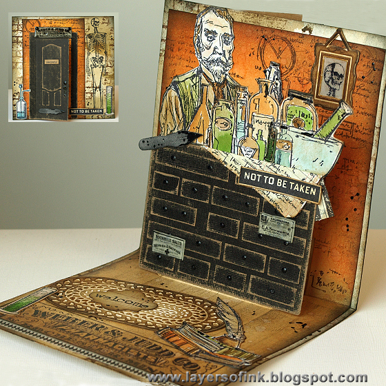
We've never celebrated Halloween, but my son is now very interested in scary stuff, spiders, bats, skeletons etc. so I thought I would do some scary crafting too. Here we step into the frightening shop of a scary old-time apothecary. Don't taste anything! I wanted to make a counter full of drawers and therefore needed a rectangular pop-up. You can place larger papers on top of most the pop 'n cuts inserts, and I found that for my large counter, the 3-D Suitcase die was most suitable. The suitcase has a flat base and is pretty large, giving me an easy surface to attach my counter to.
 
I started out by die cutting manila cardstock with the 3-D Suitcase die. My card is wider than the pop 'n cuts base dies, so I used my base tray to die cut the insert. To make sure the die doesn't shift, I adhere it to the cardstock with masking tape (first removing some of the stickiness on my clothes). The background was inked with orange and brown distress inks, making it mainly orange at the top where the wall is, and mainly brown where the floor is. The background was stamped with a text stamp from Tim Holtz Stampers Anonymous Chemist set (designed by Brett Weldele), and Archival Potting Soil ink.
 
I die cut a rectangle from black kraft-core cardstock. The drawers were made by cutting strips of the same paper, sanding all the edges and gluing them to the rectangular piece. The handles were made with black Enamel Accents. The labels come from another Tim Holtz set, but were too large for my project. I stamped them on shrink plastic, shrunk them and painted the back with Antique Linen and Frayed Burlap Distress Paint. The top was coated with Glossy Accents, to give them a finished look.
 
The counter was attached to the pop-up suitcase with double-sided tape. It is higher than the suitcase, so you don't see the suitcase at all. Just make sure that you leave a tiny bit of space at the base so that the pop-up will fold over easily.
 
Stamps from the Chemist set were stamped on the smooth side of Ranger's new watercolour paper. I watercoloured the images with Distress Inks and a paintbrush. I thought they were a bit bright and inked lightly with Gathered Twigs to tone down the colours. Enamel Accents was applied here and there for a splattered look. I also stamped the script stamp on a piece of ledger paper, crumbled it up and folded it over the pop-up so that it look as if the bottles are standing on a sheet of notes. If you look closely, you might see that there is a small shrink plastic tube next to the blue bottle, made with one of the stamps from the Laboratorie set.
 
I have a thing for pen nibs and was happy to see Tim Holtz new Writing Desk die. The pen nib was die cut from grungeboard, inked with Black Soot and Enamel Accents was used for the ink. 
 
Here's another fun little detail. I used Karen's Foyer set embossing folder and cut out only the picture frame. It was inked with Gathered Twigs and I cut out the centre and placed it over a skeleton stamped on a piece of scrap paper. The centre was coated with Glossy Accents, to make it look like glass. This is my son's favourite part of the card.  
 
At the front of the pop-up, I stamped a wooden floor with a Darkroom Door stamp and Frayed Burlap ink. I also embossed the carpet from the Foyer Set, inked it with Gathered Twigs and stamped 'welcome' on a Funky Label die cut. The black dots are Enamel Accents. The books and tube were coloured the same way as the other images stamped on watercolour paper. The sign stamp is repeated on the front of the card.
 
Apothecary Pop-Up Card - Layers of ink
The cardbase is watercolour cardstock which was coloured with Distress Stains and stamped with a brick stamp and a skeleton. Is he a customer coming out from the apothecary or planning to go inside? This was the perfect opportunity to use one my favourite dies again, the Opening Door die. It was die cut from black kraft-core and sanded. The handle was coated with Enamel Accents and I placed another pen nib on the door.

Do you recognise this sign from the inside? I wanted a sign above the door, but of course the stamp was far too large. I stamped it on shrink plastic, punched two holes and then finished it the same way as the labels on the inside. Love this look.  

If you dare to open the door, there is another sign on the inside, stamped on a Funky Label and with a Tim Holtz rub-on. The Enamel Accents made really cool dots, with dimension. 
 
It was hard to capture the dimension of this card, you might see the pop-up a little bit better here.
 
Thank you for stopping by today!

Happy crafting!

Anna-Karin

Supplies:
Surfaces: Ranger: Manila cardstock, Watercolour cardstock, Shrink Plastic; Tim Holtz Idea-ology Grungeboard; Tim Holtz Core'dinations kraft-core cardstock
Dies: Sizzix: 3-D Suitcase, Opening Door & Wreath, Funky Labels, Writing Desk, Rectangles
Embossing folders: Sizzix: Foyer Set
Stamps: Stampers Anonymous Tim Holtz: Laboratorie, Poisonous, The Chemist, Ultimate Grunge; Darkroom Door: Woodgrain
Ink: Archival Ink: Jet Black, Potting Soil; Distress Ink: Antique Linen, Spiced Marmalade, Ripe Persimmon, Rusty Hinge, Gathered Twigs, Black Soot, Broken China, Peeled Paint, Mowed Lawn; Tsukineko Stazon Jet Black
Paint: Distress Paint: Mowed Lawn, Antique Linen, Frayed Burlap
Stain: Distress Stain: Antique Linen, Frayed Burlap, Gathered Twigs
Medium: Ranger Black Enamel Accents, Glossy Accents
Embellishments: Tim Holtz Idea-ology: Chit Chat stickers, Elements tissue tape, Elements Remnant Rubs

Monday, September 9, 2013

Double Embossing Technique

Hi everyone! STAMPtember® continues at Simon Says Stamp, don't miss all the fun things that are happening. At Simon Says Stamp Monday Challenge Blog we have an embossing challenge this week.
 

 I love both dry and heat embossing and combined both in my two cards, using a fun technique.  
 
I didn't take step-by-step photos this time, because I have already done a tutorial on this technique, you can find it here. This double embossing technique is great for making an embossing folder the focal point on a project, giving great detail and depth. It works perfectly with embossing folders that have large images and/or lots of empty space. I love to cycle and this new Sizzix embossing folder is fabulous, with that great sentiment at the top too.
 
I stamped the embossing folder with a Tim Holtz number Reflections stamp, which is made to be used with stamp kissing techniques. With a normal number or text stamp, the text would have been reversed on the project. After dry embossing the paper, the numbers were heat embossed with Seafoam White powder.
 
Using a Versamarker, I applied embossing ink to the bike, one section at a time. The tires are embossed with black glitter, the metallic parts with platinum, and the rest with the great Capri Stampendous powder. Don't worry if the result doesn't look perfect at this stage, it is part of the charm and the parts you might have missed will become inked.
 
A Karen Burniston Birds on a Wire bird was embossed with Stampendous Aged Silver Embossing Enamel and placed to ride along on the basket.  

I didn't add any embossing powder to the sentiment. The card was inked with Antique Linen, Gathered Twigs and Walnut stain and the embossed areas pick up more ink, giving a great look to the sentiment. The heat embossed areas resist the ink and you will magically see the numbers appear. The cardbase is Core'dinations cardstock, sanded and inked and I finished the card with Tim Holtz paper strings, also inked.
 
In the center of the wheel I placed a Prima bottle cap and a little jeans button inside. Paint was rubbed into the words to make them stand out.
 
The second card uses the same techniques with a different embossing folder. 

For the second card, I used the pretty Butterfly Lattice folder and a text stamp from Tim Holtz Reflections set. The butterfly was embossed with the teal powder and the swirl with platinum. I left the very detailed parts and just inked them, because the ink goes darker on the embossed parts, the intricate details stand out too.
 
The teal powder is very shiny and almost looks like glass, it is hard to show on a photo. I like that you see the text even between intricate details such as the wings of the butterfly.
 
Another little Birds on a Wire was embossed with teal powder and placed on top of a Tattered Banner. The sentiment stamp comes from Simon Says Stamp pretty Beautiful Words set.
 
I hope you will join us this week in our fun challenge, as always, one lucky participant wins a $50 gift voucher from Simon Says Stamp.
 
50dollar_voucher_600px
 
Thank you for the visit!!
 
Happy embossing!
 
Anna-Karin

Supplies:
Surfaces: Neenah Smooth Cream Cardstock
Embossing folders: Sizzix: Bicycles, Butterfly Lattice set
Dies: Sizzix: Birds on a Wire, Tattered Banners
Stamps: Stampers Anonymous Tim Holtz: Reflections; Simon Says Stamp: Beautiful Words
Ink: Distress Ink: Antique Linen, Gathered Twigs, Walnut Stain; Tsukineko: Versamark
Marker: Tsukineko: Versamarker
Paint: Distress Paint: Picket Fence
Embossing powders: Ranger: Liquid Platinum, Seafoam White; Stampendous: Detail Capri Embossing Powder, Aged Silver Embossing Enamel; American Crafts: Zing Black Glitter
Embellishments: Tim Holtz Idea-ology: Paper String Stripes; Prima: Bottle Caps, Jeans Buttons

Saturday, September 7, 2013

CSI case file #88

Hello everyone! A new month and a new theme at CSI:Color, Stories, Inspiration, birthdays, together with new case files every week of course. Here's this week's case file: 
 
I thought the colours were quite seventy-ish and scrapped some of my own birthday photos.
 
CSI case file 88 - Layers of ink
From the evidence list I used: clock, globe, ledger paper, stars and a frame. I used some bullet points on the journaling (written on the tag behind the one photo) and it was also inspired by the creative theme. I had painted the painting on the right earlier that same day, my mom thought it was a bit dark and scary. I still have it and took that photo recently. I got a blackboard on this birthday, in addition to the stroller in the photo, and there is a photo of me and the blackboard, but I just couldn't find it when I made the layout. 
 
The background is ledger paper which was stamped with Wendy Vecchi's new Archival Inks (Fern Green, Orange Blossom, Potting Soil), which were perfect for this colour combo. I used stamps by Wendy, and some school themed stamps from TJ Designs and Graphic 45.
 
The clock was die cut from Prima paper, which has a pattern similar to the chalkboard on the inspiration photo, but you don't see it so well here. The large '2' is a stamp by Tim Holtz. I love mixing and layering stamps to create a background.

I wanted to mimic the blackboard that I got on this birthday, which had a yellow frame, and die cut yellow Core'dinations cardstock with one of Tim Holtz Sized Rectangles dies. To turn it into a frame, I die cut the centre with a rectangular Framelits die and rounded the corners. The chalkboard paper was die cut with the same Framelits die, so it fits perfectly inside the frame. The text was stamped with Picket Fence Distress Paint.

The pieces for this flower were in my scrap box. The two metallic layers, die cut with the Tattered Floral die, comes from a little Tattered Floral Canvas I did earlier this year. You can read how I made them here, using foil tape, modeling film and embossing folders. The canvas flower was die cut with Eileen Hull's Fringed 3-D Flower.

Thank you for looking and I hope you will join us this week!

Have a great weekend!

Anna-Karin

Supplies:
Surfaces: BasicGrey Basics Ledger paper; Ranger Manila Cardstock; Wendy Vecchi Stampers Anonymous Clearly for Art Whiteout Modeling Film; Claudine Hellmuth Natural Stick-Back Canvas; Prima Engraver 6 x 6 paper pad; Canvas Corp Chalkboard Paper
Stamps: Stampers Anonymous Wendy Vecchi: Collectible Art, Celestial Art, She Created Art; Stampers Anonymous Tim Holtz: Numeric; TJ Designs: Vintage School Days; Graphic 45 school stamps
Dies: Sizzix: Elisse, Weathered Clock, Tattered Florals, Fringed 3-D Flower, Rectangles Framelits, Sized Rectangles
Ink: Ranger Wendy Vecchi Archival Ink: Fern Green, Orange Blossom, Potting Soil; Distress Ink: Gathered Twigs
Paint: Distress Paint Picket Fence
Embellishments: ribbons

Wednesday, September 4, 2013

Gel Printing with Dies and Embossing Folders Tutorial

Hi everyone! I am sharing a mixed media tutorial on the Sizzix blog today, for how to use your dies and embossing folders for gelli printing. If you saw my Dotty Gelli Print ATC Book from last week, you might have read that I was going do a tutorial for some of the techniques used there.
 
I am always looking for new ways of using my dies and embossing folders and had so much fun doing a lot of prints.
 
I made some of the prints into cards, using dies by Tim Holtz and lots of Distress Glitter. These are four of them. I made five cards, but to try to avoid doing a super long tutorial (you should have seen how many step-by-step photos I originally had), I am sharing a bonus card here on my blog.

This background is one of the backgrounds shown in the tutorial, made by using dies as masks and stencils, to make a stamp from dies, and using embossing folders to add texture. I used the negatives of the house die cuts as masks when I did the stamping, with Archival Coffee ink. The fence was covered with Tarnished Brass Distress Glitter and the bird with Pumice Stone.

Here's a close up of all the layers of printing and stamping.

To see the whole tutorial, head over the Sizzix blog.

Thank you for stopping by!!

Anna-Karin


Supplies (for bonus card):
Surfaces: Tim Holtz Idea-ology Grungeboard;
Dies: Sizzix: Artful Dwellings, Mini Openings, On the Fence, Cobblestones, Mini Bird & Cage, Wanted, Mini Filmstrip & Tickets
Embossing folder: Sizzix: Bubbles
Stamps: Stampers Anonymous Tim Holtz: Paris to London, School Desk, Travel Ways, Mini Muse, Psychedelic Grunge, Urban Tapestry
Ink: Ranger Archival Ink Jet Black, Coffee
Paint: Distress Paint: Antique Linen, Frayed Burlap, Broken China, Salty Ocean
Glitter: Distress Glitter: Tarnished Brass, Pumice Stone
Embellishments: Tim Holtz Idea-ology Chit Chat stickers
Tools: Sizzix Big Shot; Gelli Arts: Gel Printing Plate 6 x 6

Tuesday, September 3, 2013

Carved Birds Accordion Album and Card

Hi everyone! Today I have two projects to share using the new Darkroom Door Carved Birds Vol. 2 set, designed by Godelieve Tijskens. I love these fun birds!
 
 
I had an image of colourful birds chatting with each other and decided to do an accordion card to try to capture that.
 
Carved Birds Accordion Card - Layers of ink
Both the frames and the labels were die cut from manila cardstock using Karen Burniston's 3-D Accordion Flip Album and Bracket, Frame & Label dies.The background was made by sponging Distress Ink on each panel, using a torn paper as a mask to make hills, and then again to make the grass darker towards the front. I stamped the background with the great Gazette Background stamp using Salty Ocean for the sky and Moved Lawn for the grass. The same stamp was stamped on the frame of the card, with Jet Black ink.

The birds were stamped with different colours Archival Ink and cut out. I stamped them again with Jet Black on the background, since I didn't want to cut out the little feet and since it gives a cool shadow effect. The birds were adhered with foam dots. Aren't they fabulous?
 
I used Tim Holtz Remnant rubs to give the birds something to say and draw speech bubbles around the rub-ons with a pen. I had fun picking things for them to say. The Sizzix 3-D Accordion Flip is very easy to assemble and I thought the format worked really well for my chatty little birds. Small wood veneer stars were used as embellishments.
 
Here's what the accordion looks like from the top.

I also made a card:

Carved Birds Card - Layers of ink
The carved birds look great on lots of different projects, and here I made a grungy card, compared to the bright accordion. An old book page was aged with walnut ink crystals and I stamped the bird on top with Archival Jet Black ink. The background was done by applying Viva 3-D Stamp Paint with a palette knife through a brick stencil. The sentiment comes from the Bright Blossoms Wordstrip. The branch was die cut from grungeboard with the Bird Branch die, covered with molding paste and when dry, painted with Distress Paints.

I made this fragment for another project, but never used it. Art De Fleur Montage paper was glued to the fragment with Glossy Accents and the edges were trimmed off. Here you can also see how the Viva paint shimmers.
 
Here is my carved birds post on the Darkroom Door blog. For more inspiration on the Carved Birds stamps, don't miss Godelieve's wonderful canvas.

Thank you for looking!!

Happy Stamping!!

Anna-Karin

Supplies for both projects:

Darkroom Door products:
Stamps: Carved Birds Vol. 2, Gazette Background
Paper Products: Bright Blossoms Wordstrip, Art De Fleur Montage

Other products:
Surfaces: Ranger Manila Cardstock; Tim Holtz Idea-ology Grungeboard; Core'dinations Tim Holtz kraft-core cardstock; Neenah Smooth Solar White cardstock; Daler & Rowney watercolour cardstock; old book paper
Dies: Sizzix: 3-D Accordion Flip Album, Bracket, Frame & Label, Bird Branch
Ink: Ranger Archival Ink: Jet Black, Rose Madder, Venetian Orange, Sienna, Chrome Yellow; Distress Ink: Mowed Lawn, Shabby Shutters, Tumbled Glass, Salty Ocean, Black Soot, Gathered Twigs; Tsukineko Walnut Ink Crystals
Paint: Ranger Distress Paint: Forest Moss, Walnut Stain; Viva Decor 3-D Stamp Paint: Violet
Medium: Golden Artist Paint Light Molding Paste
Stencil: The Crafter's Workshop: Mini Bricks
Embellishments: Tim Holtz Idea-ology: Words Remnant Rubs, Fragments Charms; Studio Calico wood veneer: Tiny Hearts, Tiny Stars

Monday, September 2, 2013

All Stars Stamping Pop-Up Tag

Hello and welcome! September is a very special month at Simon Says Stamp because that is when STAMPtember® is celebrated. There will be many fun things happening this whole month, don't miss them!
 
At Simon Says Stamp Monday Challenge Blog we are kicking off STAMPtember® with a Stamping All Stars challenge. Use your favourite stamps, ink or types of stamps, and more.
 
I am not good at picking favourites, especially among stamps, there are simply too many that I love.
 
All Stars Stamping - Layers of ink
 I had to narrow it down somehow and decided to go through my Tim Holtz Stampers Anonymous stamps and pick out the ones that I used the most. The pop-up tag was started without much of a plan, just using those favourite stamps of mine. Pop-ups are another favourite and I used the Sizzix Circle & Ribbon Platform. The base is manila cardstock, die cut in the Tag & Bookplates die, folding the top edge and placing it just under the top cutting line on the die, so that I got a tag shaped card.
 
I used other favourites here too, from the surfaces I worked on, to the dies and the inks.
 

I love Tim's wood stamp and clear embossed it on all sides of the tag. The tag was inked with brown shades of Distress Inks, keeping it lighter towards the centre. I did the faux batik technique and ironed off the embossing powder (always place the paper between printer paper to protect your iron and ironing board). The bottom edge isn't embossed, but I wasn't worrying about that since I was planning to cover it up anyway.
 
I stamped the background with several favourite stamps, to create even more texture. I love the bird stamp from the Mini Ornates set and the little bird stamp from Tiny Things. They were stamped with Archival Jet Black. My favourite alphabet background stamp, from School Desk, was stamped with Coffee Archival ink, holding it in my hand instead of mounting on an acrylic block, for a random impression. This alphabet background is probably my most used stamp of all time. Finally, I stamped the background here and there with a dot texture stamp and embossed with platinum powder. Tiny Textures is another set that I reach for all the time. The letters were die cut with the Wanted die and the tree was die cut from Bazzill text paper.
 
The Circle Platform base was die cut from kraft-core cardstock, which is also a favourite. The base was stamped with the alphabet stamp and a grid stamp. The circle and ribbons were die cut from manila cardstock. The circle was stamped with the ledger stamp from School Desk, which I love, using Pumice Stone ink and then one of my favourite sentiment stamps was stamped on top. The fun dimensional ribbons were inked with Peeled Paint and stamped with a grid stamp. I also added a little photo booth photo of my dad, sister and me, placed on top of a postage stamp die cut.
 
This is the front part of the inside, with a small pine tree, a swirl embossed in platinum powder and a left-over UTEE covered flower (from my Summer Memories Burlap Panel). I felt like some bling, and used a green tinsel, over tissue tape. The fabulous sentiment comes from Cosmo Cricket.
 
Here you can see what the pop-up looks like from the top. It's fun with the ribbons, and very easy to do. I used it on this card too.
 
All Stars Stamping - Layers of ink
The front of the tag card is pretty similar to the inside, with the same stamped background. I really like Tim's sentiment stamps and here I stamepd one of them on cream cardstock, which had first been inked, stamped with a ledger stamp and Pumice Stone and die cut with the Torn Notebook die. Combining the ledger stamp from School Desk and the Torn Notebook die is a great way of making your own distressed notebook pages. I layered a Bazzill vintage text paper behind it. The crinkle ribbon was dyed with Peeled Paint and Crushed Olive.

The Hinge Clip was embossed with Stampendous Aged Silver Embossing Enamel, giving it a cool look. Be careful, metal gets very hot when you emboss it.  

The border was embellished with grass die cut from kraft-core cardstock with the Tapered Fringe die and another piece of tinsel. I had a leftover modeling film/natural sticky-back canvas butterfly, from my Summer Memories Burlap Panel (check the post out to see how I made it) and also tucked a Prima wooded leave and more platinum embossed swirls in among the grass.

Join us this week in our fun challenge and it can be you who wins the $50 gift voucher from Simon Says Stamp, or gets picked to be featured as one of our Designer Spotlights.

50dollar_voucher_600px

Thank you for visiting me today!

Happy stamping!

Anna-Karin

Supplies:
Surfaces: Ranger Manila Cardstock; Core'dinations Tim Holtz kraft-core cardstock; Bazzill Antique 6 x 6 paper pad; Wendy Vecchi Stampers Anonymous Clearly For Art Whiteout modeling film; Claudine Hellmuth Natural Sticky-Back Canvas
Stamps: Stampers Anonymous Tim Holtz: Mini Ornates, Wallpaper & Wood, Way with Words, Classics #5, Tiny Textures, Tiny Things, School Desk, Ultimate Grunge
Dies: Sizzix: 3-D Circle & Ribbon Platform, Tag & Bookplates, Torn Notebook, Mini Bird & Cage, Tapered Fringe, Mini Butterflies, Pine Tree, Mini Pine Tree & Holly, Tattered Flower Garland, Mini Bottle cap & Stamp, Wanted, Bird & Butterflies,
Embossing folder: Sizzix: Bottle Caps & Rulers
Ink: Ranger Archival Ink Jet Black, Coffee; Distress Ink: Antique Linen, Frayed Burlap, Gathered Twigs, Walnut Stain, Pumice Stone, Scattered Straw, Peeled Paint, Crushed Olive
Embossing powder: Ranger Clear, Liquid Platinum, Clear UTEE; Stampendous Aged Silver Embossing Enamel
Embellishments: Tim Holtz Idea-ology: Elements Tissue Tape, Winter Tinsel Twine, Hinge Clips, Crinkle Ribbon; Prima Wood Icons Leaves & Flowers; Cosmo Cricket: Life Tiny Text stickers; twine

Sunday, September 1, 2013

Evening in Central Park

Hello stampers! A new month and a new theme at Craft a Scene, Dusk to Dawn. Lots of possibilities with this fun theme!
 
I did a different version of a the Central Park card I posted two weeks ago, to show you that if you change the colours and the mood of a scene, the same stamps can give a very different look.
 
Evening in Central Park - Layers of ink

Again, I used the gorgeous Central Park photo stamp from Darkroom Door and combined it with two Stampscapes stamps (Hiker & Child and Prickly Branches). The scene was stamped with Archival Jet Black on glossy cardstock. Instead of using different colours, as I did last time I used this stamp, I coloured it in shades of grey and black dye inks, leaving some areas (the path and parts of the sky) the white of the paper. If you have never tried to do a black and white scene, I hope you will, it is fun and it is a great way to learn more about the importance of different values in a scene, of light and dark.

Highlights were added with a white gel pen and a little bit of mist by dry-brushing white pigment ink on the scene, especially at the base of the trees. The Core'dinations background is dry embossed with a New York embossing folder and sanded. The metallic border was a leftover from this layout, it was die cut from glossy cardstock which had been covered with foil tape. Alcohol ink was applied on top to give it a tarnished look (Pitch Black, Ginger, Espresso).

Thank you for looking and I hope you will join us this month.

Happy Stamping!!

Anna-Karin

Supplies:
Surfaces: Kromecote glossy cardstock; Core'dinations Tim Holtz Kraft-Core cardstock; Ranger foil sheet
Stamps: Darkroom Door: Central Park Photo Stamp; Stampscapes: Hiker and Child 165A, Prickly Branches 272G
Dies: Sizzix: Borders
Embossing folder: Sizzix: Subway & Stencil
Ink: Ranger Archival Ink Jet Black; Adirondack: Slate, Pitch Black; Jenni Bowlin: Weather Wane; Colorbox Frost White
Alcohol ink: Adirondack: Pitch Black, Ginger, Espresso
Embellishment: Darkroom Door: New York Wordstrip; twine