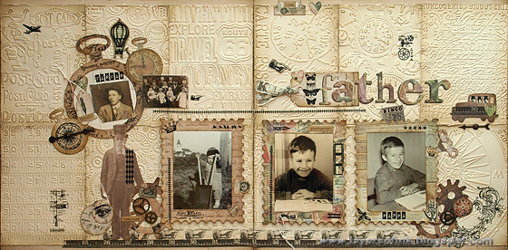
I made a double-page layout, with lots of dry embossing and die-cutting.


I used twelve different Tim Holtz Sizzix texture fades to emboss plain cardstock, inked and distressed all the pieces and covered the background with them. They were inked with Antique Linen first, and then with Frayed Burlap on the edges and to highlight certain sections. This is a favourite background technique of mine, which gives instant texture, without overpowering a layout.
Papers from Collage Mini 8 x 8 paper pad were die cut with various Tim Holtz dies, the smaller size of these papers makes them perfect for die-cutting. The Postage Stamp Frame is a movers & shapers die, and the Sized Rectangles fit perfectly inside, which means that you can easily die cut frames. Place the largest rectangle in the Postage Frame die and die cut three frames. Fold patterned paper to create an interactive flap, which can be used for more photos and journaling.
Here's the inside of one of the postage frame flaps. I still need to add some more journaling, so I left space for that.
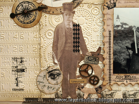
I used a full sheet of Elements Rubs on the layout. Some of them were rubbed onto the postage stamp frames and the other die cuts, some were rubbed on scrap paper and cut out, and some were rubbed onto the embossed background paper. For the pocket watch, I simply placed down one of the script rub-ons and rubbed randomly here and there, by so doing, I was able to cover the whole watch with a rub-on which is smaller than the watch. It is a great way to get more out of your rub-ons. I did the same on the gear die cuts.
The pocket watch was die-cut twice, once with and once without a Sized Circle inside, creating a frame. Inside the pocket watch, I placed one of the few photos I have of my grandfather (he passed away when my dad was still a child) and next to it is a photo of my great grandparents and their children.
One of my favourite details on this layout is the little men sitting inside the car. Die cut the car from patterned paper and place it on a piece of light coloured scrap, trace the windows with a pencil, so that you know where to place the rub-ons. Cut the three men in the rub-on image apart and place one in each window. Erase the pencil marks and place the car on top.
I used all the little tabs and tags from the Tiny Tabs & Tag die, placing them here and there and embellishing them with rub-ons.


I hope you will join us this week and remember that anything goes! As every week, our sponsor Simon Says Stamp gives a $50 gift voucher to one random participant.
Happy crafting!
Anna-Karin
Supplies:
Surfaces: Tim Holtz Idea-ology Collage Mini 8 x 8 paper stash, cream cardstock
Dies: Sizzix: Postage Stamp Frame, Sized Rectangles, Sized Circles, Pocket Watch Frame, Mini Clock Key & Pocket Watch, Gadget Gears, Tiny Tabs and Tags, Mini Old Jalopy & Arrow, Word Play
Embossing folders: Sizzix: Airmail & Compass, Blueprint & Gears, Bottlecaps & Rulers, Checkerboard & Cracked, Distressed Frame & Postal, Eiffel Tower & French Script, Pocket Watches & Steampunk, Travel Signs, Word Play
Ink: Distress Ink: Antique Linen, Frayed Burlap, Vintage Photo
Embellishments: Tim Holtz Idea-ology: Elements Remnant Rubs, Elements Tissue Tape, Game Spinners, Sprocket Gears, Mini Gears, Long Fasteners, Mini Fasteners, Label Letters


Wow, love this, what a brilliant LO with a difference, for to me it is so much more than just a LO. Love all the additional stamping and elements, so much to look at and admire, - a brilliant make, love it!!
ReplyDeleteEverything Astrid said!! Brilliant use of the embossing folders, utterly wonderful composition and embellishing, love the photo framing, and then the extra one inside the flap - this is stunning Anna-Karin!
ReplyDeleteAlison xx
Just lovely ... this is just such a wonderful way to capture snapshots of your father's childhood. I really like the embossed background panels. Genius!! And the element rubs on the pocket watch die cut frame is incredible. But my favorite thing about your LO is the composition of photos with all the elements of the pages. They really highlight the star of these pages ... your dad (and grandfather). Treasured moments.
ReplyDeleteAnna-Karin...your layout is such a sweet tribute to your dad. I love the monochromatic you've done on your background, relying on the dry embossed texture to create the interest. It's very effective and beautiful! I also love the interactive pieces of your layout. And all of the die cuts and embellishments strategically placed create such a lovely spread. <3 Candy
ReplyDeleteBelo trabalho! Amo fotos expostas pela casa, principalmente as antigas! Abraços!
ReplyDeleteGorgeous Anna-Karin, love the wonderful texture from the embossing. Love the soft colour palette and wonderful,use of the die cuts too. Love,how,you have showcased the images in the postage stamp die .wonderful. Tracy x
ReplyDeleteHi, Anna-Karin, wow...this is just an amzing layout! I love the gorgeous embossed background, fun flaps and the pretty die cuts. Al the details are just fabulous. :)
ReplyDeleteSaw this fabulous layout on the Simon Says blog and had to come over to say, " WOW" I love this. How was I to know I would love it even more when I got here. The embossing, the embellishment, the wonderful sepia color tones. Gorgeous. What a great man page.
ReplyDeleteWOWZERS!!!! I totally love the patchwork of embossed panels to make up the background...genius! The stamp shaped frames are wonderful elements as well! This is a keepsake to treasure for a zillion years! Love the photos!
ReplyDeleteI wish I could see you put your art together! It would be so fun to see you design your projects. This is fabulous! The embossed panels are brilliant and then all the monochromatic colors are simply gorgeous!
ReplyDeletethis is gorgeous, love the neutral colours and fab layers of textures x trace x
ReplyDeleteDear Ana-Karin: I have posted so many words to describe how wonderful your art is. But just to put it simply, you make the most marvelous things. I love everything you do! Thank you once again!
ReplyDeleteSo cool your double layout, Anna-Karin! Love the patch embossed paper for the background! So much texture and gorgeousness! Hugs, Sandra
ReplyDeleteLovely layout!! Love the embossed textured background!
ReplyDelete*mwah*
Steph
Simon Says Stamp!
Realy interestng combination of embossing backgrounds! Fantastic details! Thanks for such amazing example of different technics!!!
ReplyDeleteI almost don't know where to begin complimenting this LO because there are so many details to comment on. What I think is the most awesome feature is the dry embossed & inked background pieces! Just fab!
ReplyDeleteAbsolutely gorgeous dear Anna-Karin. I adore all the texture and how beautiful it all came together. You truly shine my friend!
ReplyDeleteWOW! Brilliant!
ReplyDeleteI am in love with all of this texture!
ReplyDelete