Pages

Thursday, May 30, 2013

Reading Chair Pop-Up Tutorial

Hi everyone! Today I am sharing a step-by-step Sizzix tutorial using Karen Burniston's new Journey collection. You can see all the dies here, each one is so much fun and they work wonderfully together and in combination with Karen's previous collections.

Reading Chair Pop-Up Tutorial - Layers of ink
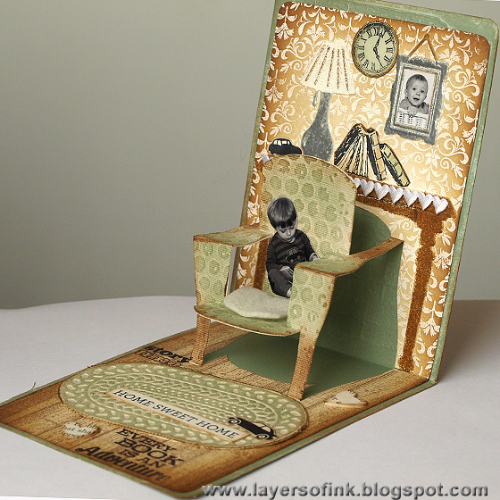
This is the inside of the card, a really cute indoor scene, with the super fun 3-D Chair in the centre. I love to create little scenes and to add photos to my pop-ups (see this tutorial too), and knew that someone had to sit in that chair, so I created a cozy reading corner for my son. We'll be doing both dry and heat embossing to create the different textures on the card.

Since you need a door to walk into a room, I used Karen's Opening Door die on the front of the card. Let's start with the tutorial:

Place the Chair pop-up in the Pop 'n Cuts Base die and die cut from smooth cream cardstock. The Journey collection has a new square base die with an ornate edge, but I didn't use it here, since I wanted a bit more space to build my scene.

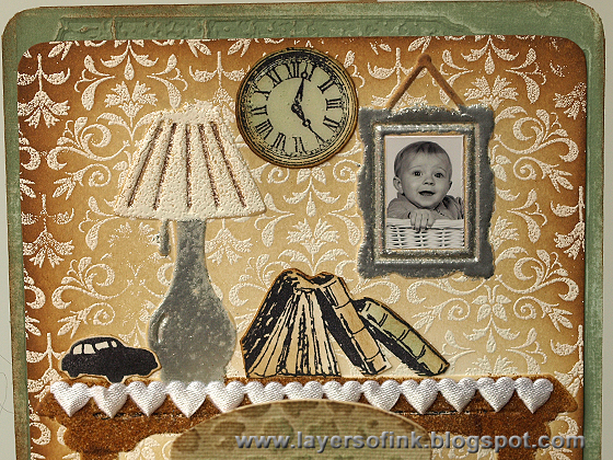
There are two embossing folders that coordinate with the Chair pop-up and we'll be using both here. One great technique to use together with the folder that has a table, lamp and frame, is the kissing technique. Ink up a stamp with embossing ink and stamp it on the embossing folder, on the side where the pattern is recessed. Ink and stamp again to cover the whole folder. Place the top of your die cut chair cardstock on the other side of the embossing folder (so that it lines up with the floor of your pop-up) and carefully close the folder and emboss.

Sprinkle white embossing powder on your paper and watch how the stamped impression has transferred to the paper from the embossing folder, but only to the parts that aren't embossed. I removed the embossing powder from the chair with a small paint brush, but you can leave it too. Sometimes it can be harder to adhere things on top of melted powder, which is the only reason why I removed it. If there is any stray powder on the table, lamp and frame, brush that off too. Melt the powder with a heat gun.

I decided to continue playing with embossing powders. Carefully apply embossing ink with a pen to the embossed parts, one section at a time and sprinkle with embossing powder. Brush off any stray powder with a small paint brush. Melt the powder and continue to the next section. I used silver powder for the frame and the lamp post, Seafoam White for the lamp shade and Vintage Photo Distress powder for the table, to give it a different texture. I did the table in three sections. You can use other colours of embossing powder and get a different effect. If you want to, you can leave out this step, and just ink the scene instead.

Ink with Antique Linen and Gathered Twigs Distress Ink, using an ink blending tool. Watch the magic as the embossing resists the ink.

Die cut just the chair again from natural sticky-back canvas and emboss in the Bubble folder.

Adhere natural sticky-back canvas to a piece of cardstock and emboss in the mat folder. Love this texture. Adhering the canvas to the cardstock first, gives the embossing a bit more punch. Cut the mat out and fray the edges a little.

Ink both the chair and the mat with Bundled Sage and Gathered Twigs.

Our room needed a floor, and I love a wooden floor. The Darkroom Door Woodgrain stamp was perfect for this and was stamped with Versafine Vintage Sepia ink. Place a piece of scrap paper at the fold of the paper, to avoid stamping on the wall of the room. Don't worry about stamping on the chair since we are going to cover it up.

One of my favourite dies from the Journey collection is the Flower & Heart, which die cuts five perfect little hearts. I had a left over piece of mat board which had been covered with old book paper and die cut hearts from that.

To further embellish my little indoor scene, I printed two photos in two different sizes. We always have cars everywhere you look, so I stamped two small cars. The books were stamped, inked and cut out, to be placed on the table and the room needed a little clock on the wall. I also used my favourite Birds on a Wire die (but for the outside), the birds were inked with Bundled Sage and Gathered Twigs. I ended up only using one of them. I also found a little heart ribbon as a table cloth.

Adhere the sticky-back canvas chair on top of the cardstock one and glue the photo to the chair. I cut a little pillow from cream felt. Looks cozy, doesn't it?

I placed a tiny photo in the frame. The clock was coated with Glossy Accents and left to dry before gluing it to the wall. I used a Distress Marker to add some detail to the lamp shade. Glue a ribbon table cloth to the table and place small stamped items on top.

You can see the texture of the embossing powder and Glossy Accents better on this photo.

Adhere the mat to the floor at an angle and place a small stamped image on top. I also stamped the floor with two sentiment stamps, added another one stamped on a strip of paper and used three of the little hearts.

I used Core'dinations Tim Holtz Distress Color-Core cardstock (Bundled Sage) for the base. The front was embossed with the Bricked folder, sanded and inked with Gathered Twigs.

Die cut the door from cream cardstock, ink with Antique Linen and Gathered Twigs and stamp with the Woodgrain background stamp, as on the floor on the inside of the card.

Mount the panels with foam dots and colour the handle with Brushed Pewter Distress Paint before gluing it to the door. Adhere the door to a piece of torn old book paper and tape to the background.

On the inside of the door (which is inked with Antique Linen), I stamped another sentiment, adhered the larger of the two photos and a word with Tim Holtz Label Letters.

Coat the bird with Glossy Accents and let it dry before gluing it to the top of the door.

Here's another view of the pop-up from the top. I can think of so many different things to do with this chair die. It is so much fun and imagine the face of the recipient opening a card with this pop-up inside.

Thank you for joining me in this tutorial!

Happy crafting!

Anna-Karin

Supplies:
Surfaces: Sizzix Little Sizzles white mat board 6 x 13; Core'dinations Tim Holtz Distress Color-Core cardstock; Claudine Hellmuth Natural Sticky-Back Canvas; Neenah Smooth Cream cardstock; felt, old book paper
Dies: Sizzix: 3-D Chair pop-upFlower & Heart, Opening Door & Wreath, Birds on a Wire, 3-D Card Horizontal A2
Embossing folders: Sizzix: Foyer Set, Bubble & Honeycomp set, Bricked & Woodgrain
Stamps: Stamper's Anonymous Tim Holtz: Tiny Things; Darkroom Door: Woodgrain Background; Hero Arts: Antique Flower Background S5264,I love Books ST506, Come Fly With Me 331481, Going CL478, Home Sweet Home ST513; Artistic Outpost: Favorite Book
Ink: Ranger Archival Jet Black; Distress Ink: Antique Linen, Bundled Sage, Gathered Twigs; Versafine Vintage Sepia; Tsukineko Versamark pad and pen
Paint: Distress Paint: Brushed Pewter
Embossing powder: Ranger Distress Embossing Powder: Vintage Photo, Ranger Seafoam White, Silver
Embellishments: Tim Holtz Idea-ology Label Letters; ribbon
Wednesday, May 29, 2013

Through a Forest Wilderness tutorial

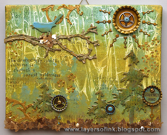
Hello everyone! Today I am sharing a step-by-step tutorial on the Simon Says Stamp and Show blog, inspired by this week's challenge theme 'Into the Woods'. I had so much fun making this Through a Forest Wilderness board:

I am a real forest person and forests are my favourite natural setting, if I could, I would walk or cycle in a forest every day. I wanted to do a board for my study which celebrates the beauty of forests, so that I can look up from my desk and find myself among the trees in a forest. I used a fun technique with Distress Paints for the background, which gives awesome texture. I am also going to show some other techniques you can use to add texture to a project. The techniques can be used on many different types of projects.

Don't forget to join us this week and make something inspired by our 'Into the woods' challenge. As every week, our great sponsor Simon Says Stamp gives a $50 gift voucher to one random participant.


To see the whole tutorial, head over to the Simon Says Stamp & Show blog.

Happy crafting!!

Anna-Karin

Monday, May 27, 2013

Through a Forest Wilderness

Hi everyone! This week our challenge at Simon Says Stamp & Show is 'Into the woods' - this can be many different things, use woodgrain, include actual wood, do a layout about a forest theme, use trees, etc.

I am a real forest person, forests are my favourite natural environments, and for this challenge I did a step-by-step tutorial, you'll have to check back at the Simon Says Stamp & Show blog on Wednesday to see it. Here's a little sneak peek:


I hope you will join us this week! As always our wonderful sponsor Simon Says Stamp gives a $50 gift voucher to one lucky participant.


Happy crafting!

Anna-Karin

Saturday, May 25, 2013

CSI case file 73: Oh, the places you'll go

Hello everyone! A new CSI case file is up, it is a happy and vibrant one, with a stunning colour combo:


I love orange, but realised I hadn't used it for a while in my projects.

From the evidence I used: architectural structures, birds, circles, and tone-on-tone, and from the evidence I was inspired by 'Wander' and also placed a caption through the centre of my journaling circle. I had these photos of my son reading in his pajamas, which fit real well with the colour combo. For the background I used watercolour paper and mixed up the orange in the case file (it dried a little bit lighter than I was expecting) painting it on the layout. I was happy to get hold of some of Ronda Palazzari's fabulous stencils and used three of them here: Mini Urban Landscape, Mini Confetti and Mini Subway.

The fun Impression Obsession Snapshot in Time stamp was stamped with Archival Jet Black ink on smooth cardstock and inked with Memento Gray Flannel. I stamped a Darkroom Door sentiment from New York Vol. 1 on each frame. Love these small sentiment stamps. The date stamp comes from the Photography set.

The Mini Urban Landscape stencil has two sections, a bold background one and a more detailed one that fits on top. I first inked the bold one with Tumbled Glass, dried the ink and then used the detailed one with Memento Teal. Love how it turned out. The title was stamped with letter stamps and I also printed out a quote.

The Subway stencil was inked with Memento Gray Flannel, love the movement it gave to the page, and it also reinforced the message. I used Note to Self Thinlits to cut the frame for the journaling, inked it with Gray Flannel, and discovered that the middle one of Tim Holtz Sized Circles fit perfectly inside. A Darkroom Door sentiment was stamped on a strip of inked cardstock and placed in the centre. Journaling: 'I hope you will do so many fun things. Travel to new places, both for real and through the world of books. There you can even travel in time." The canvas-covered grungeboard arrow was in my scrap box, I stamped it with another Darkroom Door stamp.

The birds were stamped with Tumbled Glass, first misting the stamp lightly with water, I got some extra ink on the paper and painted over the stamped birds with water to blend them into the background and remove the messy ink.

Thank you for looking! I hope you will join us this week!

Happy scrapping!

Anna-Karin

Supplies:
Dies: Sizzix: Sized Circles, Note to Self, Mini Old Jalopy & Arrow
Stamps: Darkroom Door: New York Vol. 1, New York Vol. 2 ,Venetian Vol. 1, Photography; Impression Obsession: Snapshot in Time; Stamper's Anonymous: The Birds; Hero Arts/Studio Calico: Come Fly With Me, Basic Lowercase Letters
Ink: Ranger Archival Jet Black; Distress Ink: Tumbled Glass; Memento: Gray Flannel, Teal Zeal
Paint: Daler & Rowney watercolours
Surfaces: Daler & Rowney watercolour paper; Neenah Smooth Solar White cardstock
Stencils: The Crafter's Workshop Ronda Palazzari: Mini Urban Landscape, Mini Subway, Mini Confetti
Embellishments: Tim Holtz Idea-ology tissue tape

Friday, May 24, 2013

12 Tags of 2013 May

Hi! Today I am sharing my version of Tim Holtz 12 tags of 2013 May. I had lots of fun with the mix of rubs, stamps and Distress Stains. I haven't used rub-ons in quite some time.

12 tags of 2013 May - Layers of ink
I wanted to used the fabulous ship stamp, love Tim's transportation stamps and I am happy they are now available in a smaller size (Travel Ways set). When applying the rub-ons, I planned where the ship would be stamped so that I had a rough idea of what to place where. I didn't apply my rub-ons quite as distressed as Tim did, but instead, I sanded them a bit before inking the tag with Distress Stains.

I placed the distress stains (Salty Ocean, Squeezed Lemonade, Spiced Marmalade) on my craft sheet so that it would roughly look like the sea and a sunset once they were transferred to the tag.  
 
I love the small word rub-ons, the perfect little addition to a project. The birds and compass were stamped and the rest of the images are rubs. The crinkle ribbon was dyed with Squeezed Lemonade and Salty Ocean.

I also added two mini gears which were distressed with Salty Ocean and Peeled Paint Distress Paint.

I first rubbed Salty Ocean paint into the words, then changed my mind and used white instead, which resulted in nice textured letters. The word band was dabbed with Black Soot paint to distress it and the brads were painted with Salty Ocean.

Star rubs on the ship, a number from Label Letters and I like the sentiment in the water, with the bits of white to highlight it.

I didn't have the enameled tags that Tim used, so instead I made my own by die cutting a tag from grungeboard with the Sizzix Tiny Tabs & Tags, which is a very useful die to have. I painted it white, sanded the edges and distressed it with a needle tool. It was inked with Black Soot and coated with my trusty Glossy Accents. When the Glossy Accents was dry, I rubbed on the words.

More rubs and stamping. The little bits of one of the text stamps from the Travel Ways set adds great texture.

Thank you for looking!!

Anna-Karin

Supplies:
Dies: Sizzix: Tiny Tabs & Tags
Stamps: Stamper's Anonymous Tim Holtz: Travel Ways, Warehouse District, Mini Ornates
Ink: Distress Ink: Black Soot, Salty Ocean; Ranger Archival Jet Black
Stain: Distress Stain: Squeezed Lemonade, Salty Ocean, Spiced Marmalade
Paint: Distress Paint: Picket Fence, Salty Ocean, Peeled Paint, Black Soot
Surfaces: Tim Holtz Idea-ology grungeboard; manila tag
Embellishments: Tim Holtz Idea-ology Remnant Rubs: Words, Numbers, Elements; Label Letters, Mini Gears, Word Bands, Crinkle Ribbon, Long Fasteners, Mini Fasteners
Adhesive: Ranger Glossy Accent

Thursday, May 23, 2013

Clear Butterfly Pop-Up

Hello everyone! Today I have a pop-up card to share which features a bunch of fun techniques: dies, clear elements, inky watercolour paper, stamping and molding paste. I was sending something to Karen Burniston (for a project you'll have to wait a while to see), and I sent this card a long. She received it yesterday, so now I can share.

Clear Butterfly Pop-Up - Layers of ink
When starting out, I only knew that I wanted to make a clear pop-up and see if it would work to use a stencil and molding paste to add something to it. I made stencils using the Mini Butterflies dies (see this tutorial). First the acetate was stamped with a swirl stamp and white Stazon ink, which adds great depth to the card. The acetate was die cut with the 3-D Label pop-up, using the pop 'n cuts base tray.

I mixed blue and yellow paint into light molding paste, not letting them mix completely to add colour variation to the butterflies. I got this idea from a post by Jan Hobbins. Thank you for this idea Jan! The paste was applied through my homemade stencil with a palette knife and left to dry. When dry, I dry-brushed a bit of yellow paint on top to increase the texture and added a rhinestone trail. It looks like the butterfly is sort of floating on the pop-up.

I added two molding paste butterflies on the inside, using both of the Mini Butterfly dies.

A Darkroom Door sentiment stamp, from the Bright Blossoms Vol 1 set, was stamped on a label die cut from ledger paper. I used watercolour paper as my base for the card, applied Distress Stains to my craft sheet and misted the paper heavily with water before dragging through the inks. It was stamped with a new Hero Arts ledger stamp and one of my favorites, the alphabet stamp from Tim Holtz School Desk set.

Love this layered stamp look. The small sentiment stamps come from Darkroom Door Wildflowers Vol. 1 set.

This is the front of the card. The flowers were die cut from scrap papers using the Tattered Flower Garland die and layered together with a brad in the middle, the flowers on the inside of the card were done in the same way. A Simple Saying was stamped on a Tattered Banner die cut from ledger paper.

 
I had some left over paste, and used a Mini Mosaic stencil on the front of the card to apply it through. You can see that the blue and yellow paints have mixed more at this stage, giving a greener colour. This was left to dry before colouring the background with Distress Stains.

I stenciled a third butterfly on acetate, cut it out and adhered with foam dots. On this butterfly, you can clearly see that the acrylic paints weren't completely mixed.

Here you can see the mechanism of the card better, it is hard to photograph clear pop-up cards.
Thank you for looking!

Anna-Karin

Supplies:
Dies: Sizzix: 3-D Label pop 'n cuts, Pop 'n Cuts Base Tray,  Love Set Sizzlits, Mini Butterflies, Tattered Banners, Tattered Flower Garland
Stamps: Darkroom Door: Bright Blossoms Vol. 1, Wildflowers Vol. 1; Stamper's Anonymous Tim Holtz School Desk, Tiny Texture, Simple Sayings; Hero Arts: Life Can Be S5773, Friend Collage AC022
Ink: Ranger Archival Jet Black; Distress Ink: Broken China; Stazon White
Stain: Distress Stain: Mustard Seed Squeezed Lemonade, Tumbled Glass, Evergreen Bough
Paint: Golden Artist Paint: Cobalt Blue, Primary Yellow
Medium: Golden Artist Paint Light Molding Paste
Stencil: The Crafter's Workshop: Mini Mosaic
Surfaces: Daler & Rowney watercolour paper; 7Gypsies Postale Ledger 8 x 8 pad; Studio Calico Classics 3 6 x 6 pad; acetate
Embellishments: Panduro white rhinestones; lace trim

Monday, May 20, 2013

Time Accordion Card

Which is your favourite ink pad? Which inkpad do you reach for the most? This week at Simon Says Stamp & Show the challenge is to use your favourite ink pad.

This is almost an impossible choice for me, I have many favourite ink pads, but of all of them, Ranger Archival Jet Black ink is the most versatile and the ink I use the most. It makes its appearance of almost every project of mine.  I love that it is waterproof and can be stamped on many different surfaces.

I made a double-high accordion card using Karen Burniston's Sizzix Accordion Flip 3-D album die. You can see how to make the album double-high here. This height was perfect for the new Tim Holtz Time Traveler stamps, by Brett Weldele. Fabulous images and lots of fun to colour.
 
I love making accordion cards and little books (here's another double-high one and here's a tutorial for an ordinary sized one). They are so much fun to make and to receive and there is plenty of space for embellishments.

I stamped the two gentlemen on watercolour paper with Archival Jet Black ink. Here's my well-used ink pad, I actually had to re-ink it again just yesterday. This ink pad is never far from my reach on my desk. It doesn't even have a storage place, because I always leave it straight in front of me.

I also decided to use three of my favourite Distress Inks: Antique Linen, Gathered Twigs, and Salty Ocean, for all the colour on the card. I couldn't craft without Antique Linen, it is my most used Distress Ink. Love the blue of Salty Ocean and the brown of Gathered Twigs. They look great together too.

After letting the Jet Black ink dry for a while, I watercoloured the gentlemen with the tree Distress Inks. This is one of my favourite ways of using both the Archival Ink and distress ink. If you are planning to watercolour, you need to stamp with a waterproof ink, otherwise it will smear. I just smeared the three distress inks on my craft sheet, gave them each one mist of water and coloured the images with a paint brush. Depending on how much water you use, you can get many shades of colour from just one ink pad. I always make sure to mist at the edge of a colour on my craft sheet, so that I have some concentrated ink to work with too.
 
This is the front of the card when it is closed. I stamped the edges with a stamp from Tim Holtz School Desk set, again with the Jet Black ink.
 
The letters were die cut from black kraft-core cardstock, sanded and inked. The panels were die cut from natural sticky-back canvas and coloured by smearing Salty Ocean and Gathered Twigs on my craft sheet, misting the canvas heavily with water (you can even go and run it under a tap) and then dipping it into the ink. When dry, I used a background stamp to add texture, stamping with Gathered Twigs.

The light bulb was distressed with Antique Linen Distress Paint.

The clock was stamped on Ranger's Specialty Stamping paper with Archival Jet Black. I love the detail you get with this ink on Specialty Stamping and on glossy cardstock. I just couldn't help to add some gears and game spinners too.

The second panel of the card, also photographed with the card closed, to better capture the details. This gentleman was coloured the same way. After cutting them out, I inked the edges with Gathered Twigs. I stamped a sentiment from Elements of Time on the canvas panel, with Archival Jet Black.

The edges of the canvas panels were frayed a bit and inked with Gathered Twigs.

The ticket was die cut from Specialty Stamping Paper, stamped with the coordinating ticket stamp and inked with Gathered Twigs. Isn't it a great brown? I also used some chit chat stickers.
 
Here's a view from the top so that you can see the mechanism of the card.
 
I hope you will join us this week and show us a project with your favourite ink pad. As every week, our wonderful sponsor Simon Says Stamp gives a $50 gift voucher to one random participant. 


Thank you for the visit! I hope you will have a great week!
 
Happy Stamping!!
 
Anna-Karin

Supplies:
Stamps: Stamper's Anonymous Tim Holtz: Time Travelers, School Desk, Warehouse District, Stuff to Say, Going Somewhere, Elements of Time, Ultimate Grunge
Dies: Sizzix: Accordion Flip 3-D Album, Bracket Frame & Label, Mini Filmstrip & Tickets, Wanted Sizzlits
Ink: Ranger Archival Ink Jet Black; Distress Ink: Antique Linen, Gathered Twigs, Salty Ocean
Paint: Distress Paint Antique Linen
Surfaces: Tim Holtz Idea-ology Lost & Found paper stashClaudine Hellmuth Natural Sticky-Back Canvas; Tim Holtz Core'dinations Kraft-Core cardstock; Ranger Specialty Stamping Paper; watercolour paper
Embellishments: Tim Holtz Idea-ology: Game Spinners, Sprocket Gears, Long Fasteners, Light Bulbs, Chit Chat stickers